Advocating for the washer

How research with gig workers shaped a two-sided car wash marketplace around faster, more flexible access to earnings.
Washy is an on-demand car wash marketplace made up of two apps that have to work as one system: Washy for Car Owners, where people book a wash and set their car’s location, and Washy for Car Washer, where washers receive jobs, complete the work, and get paid.
I designed both sides of the marketplace end to end.
The handoff
One wash had to make sense in two different apps
A single wash exists in two places at once.
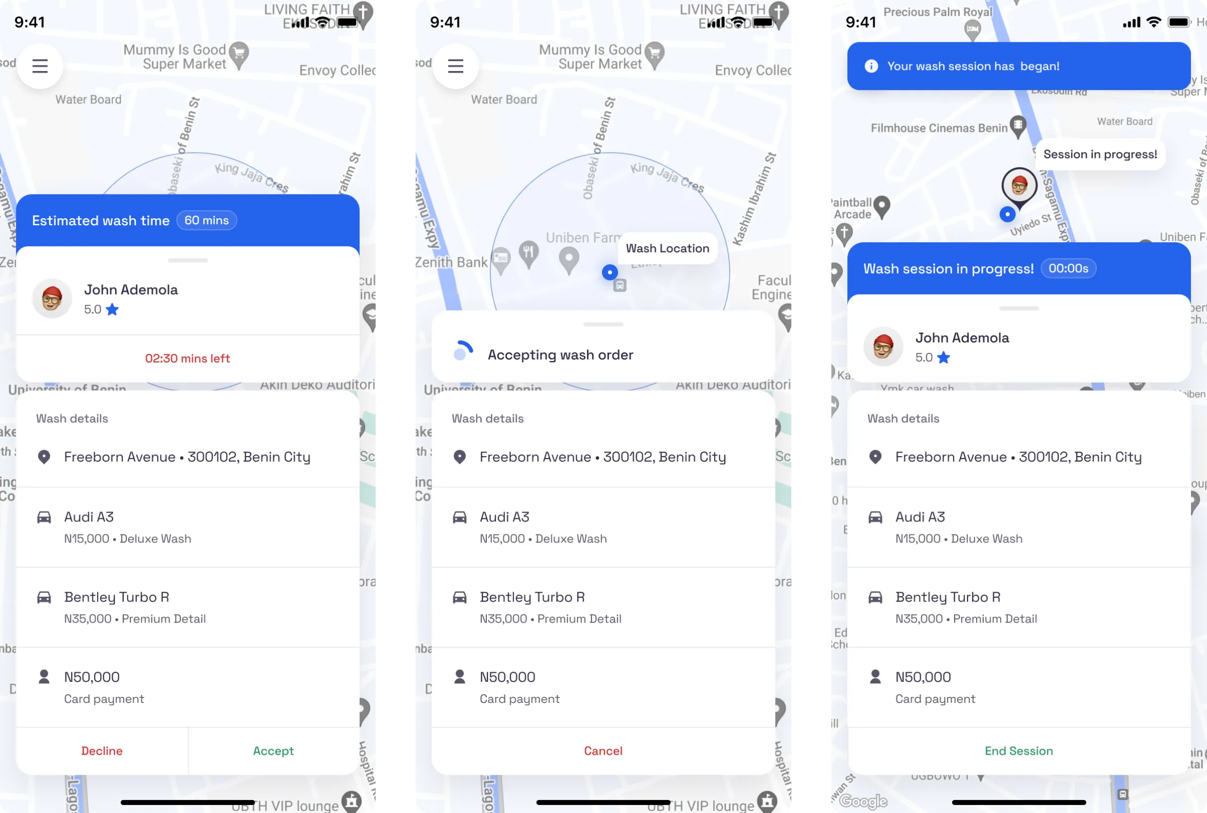
In Washy for Car Owners, someone chooses a location and service, then sends a request. On the other side, a washer receives that same request as a job they can accept: who it is for, where it is, which cars and services are involved, how much they will earn, and how long they have to respond.
Most of my work was making that handoff feel immediate and obvious from both directions, so the experience felt like one connected system rather than two separate products.
The washer sees everything needed to accept or decline in seconds: customer, location, cars, payout, and response time.
The research
There were no washers yet, so I researched the closest proxy
Washy had not launched, which meant the washers I was designing for did not exist as a user group yet. Rather than rely entirely on assumptions, I spoke to the closest behavioural proxy I could find: people already driving for Uber and Bolt.
The work itself was different, but the conditions around it were similar. Both groups perform on-demand, app-dispatched work, earn per job, and depend on a platform to track and release their money.
The interviews could not tell me everything about future washers, but they could expose problems that commonly emerge in this kind of work.
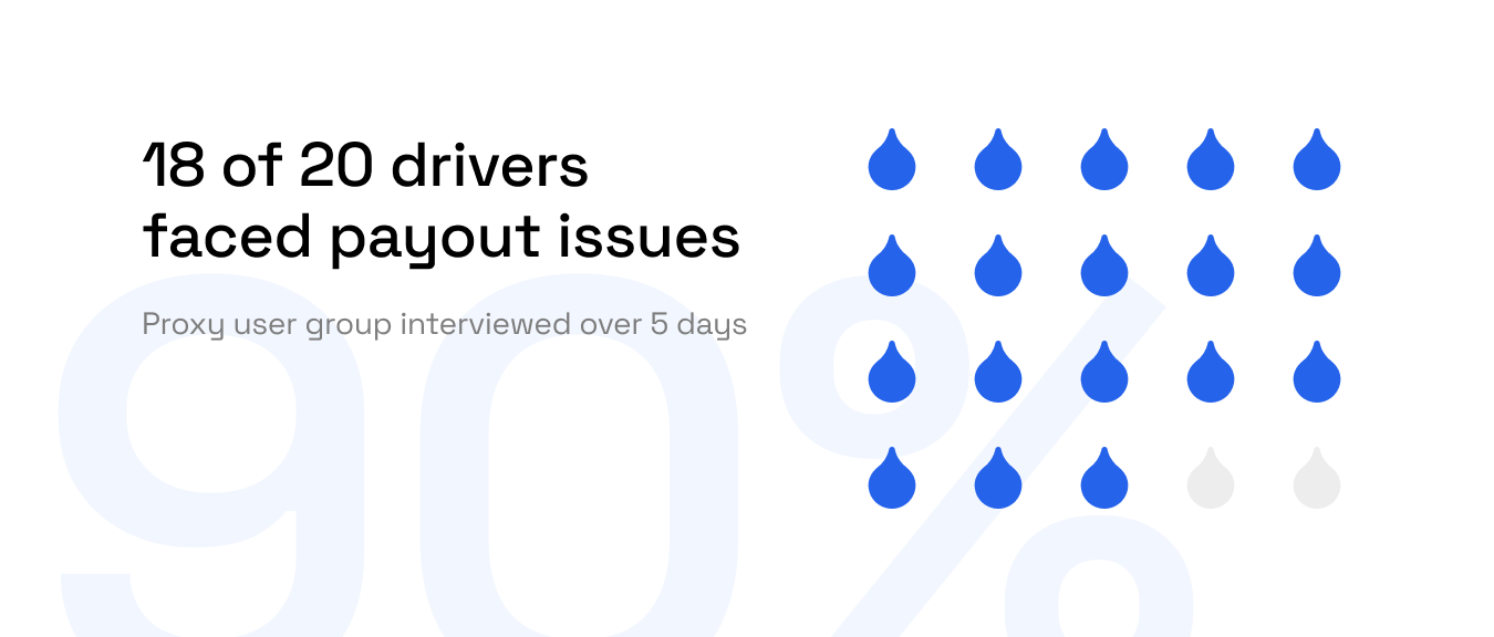
20 drivers over five days. Payout wasn’t their highest-ranked complaint, but it was the finding most relevant to the product I was designing.
The loudest complaint wasn’t the most relevant one
Drivers raised several frustrations, and payout access was not at the top of the list. Fees were the issue that most affected how they felt about the work.
But my job was to design a car wash marketplace, not redesign rideshare. I filtered each finding through one question:
Would this problem also apply to someone working through Washy?
Payout access was the finding that clearly did. It was also the one that had the greatest potential to shape the washer experience.
“I would never take card rides until the app forced me to do so to clear my debt.”
The reframe
Waiting for payday was creating a cash-flow problem
When drivers accepted in-app card payments, their earnings entered a delayed, fixed payout system. If something urgent happened during the week, they could not immediately access money they had already earned.
Some responded by avoiding card jobs. Others relied on debt to bridge the gap until payday.
A payment system intended to organise their earnings was quietly pushing them towards workarounds that left them with less control.
That reframed the washer experience for me. This was not simply an earnings-screen problem. It was a cash-flow problem.
The design
So I made payout timing a choice, not a restriction
I designed earnings as something washers could control, rather than something they had to wait for.
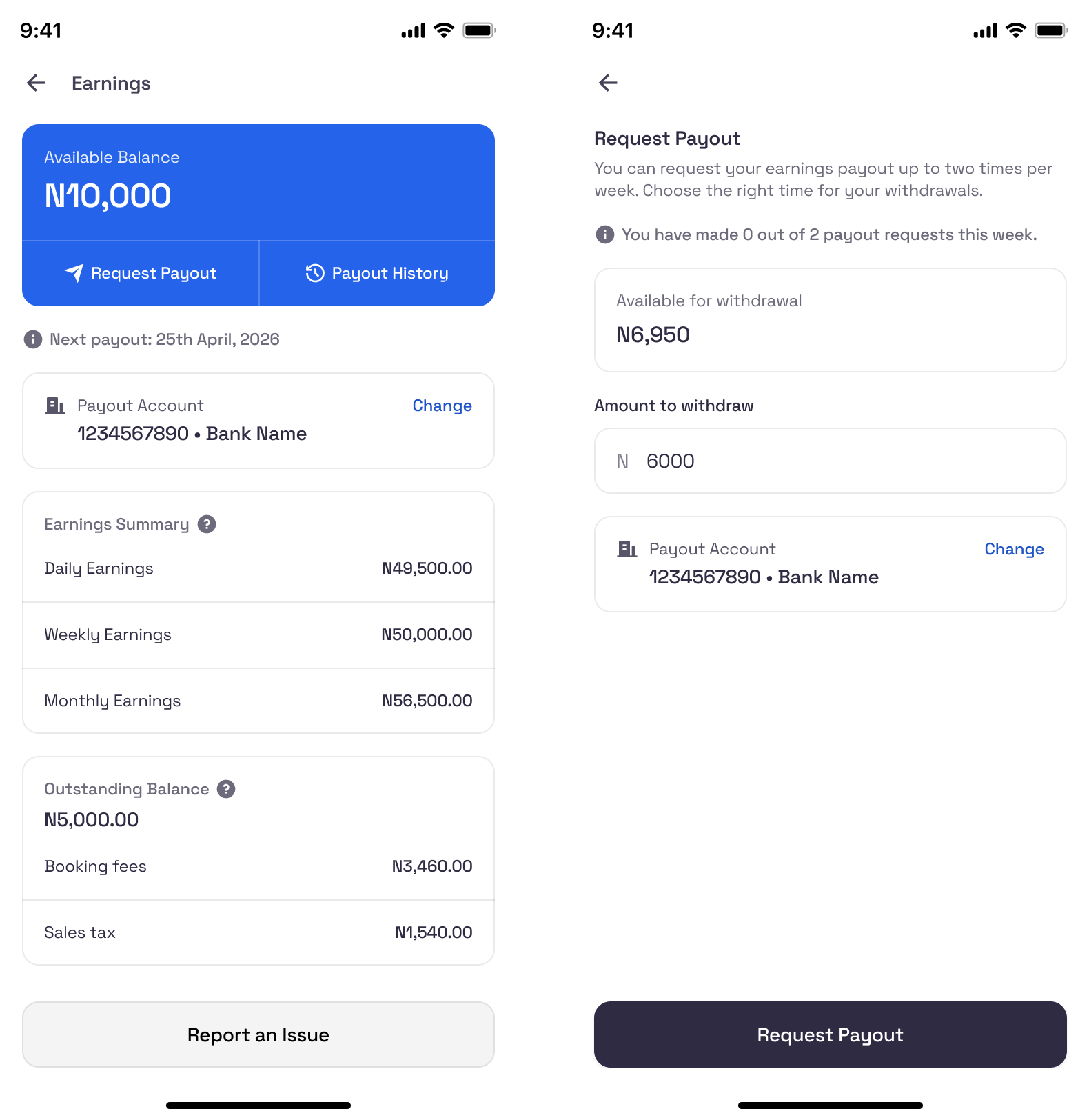
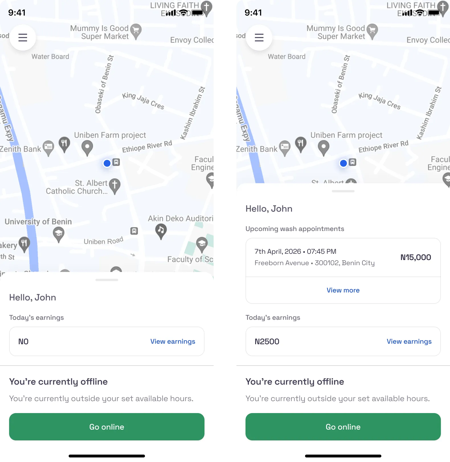
The Earnings screen leads with the available balance and places Request Payout front and centre, allowing washers to access their money when they need it. Scheduled payouts still exist for people who prefer them, and washers can choose their withdrawal frequency.
The fixed payday became a default, not a cage.
Available balance comes first, with payout as a primary action and adjustable timing beneath it. Control sits with the washer.
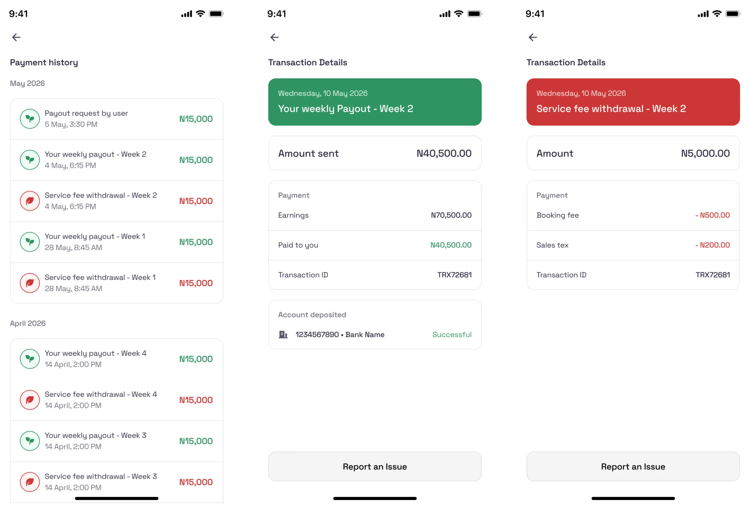
A clear record of earnings, payouts, and fees keeps the money from feeling like a black box.
The business case
Better access to earnings could also keep work on-platform
It would be easy to treat faster payout access as a worker benefit with little commercial value. But the interviews suggested otherwise.
When drivers could not reach their earnings, some worked around the platform by favouring cash payments or moving transactions off-app. Every workaround meant the platform lost visibility into the job, the fee attached to it, and the data it produced.
That gave the business a clear reason to care about payout access. If washers could reach what they had earned without working around the system, they would have less incentive to move transactions elsewhere.
The user benefit and the business opportunity pointed in the same direction: give washers more control over their money, and make staying on the platform the easier choice.
Advocating for the washer was, in this case, the most commercially sensible thing I could do.
What shipped
Both sides of the marketplace, designed as one system
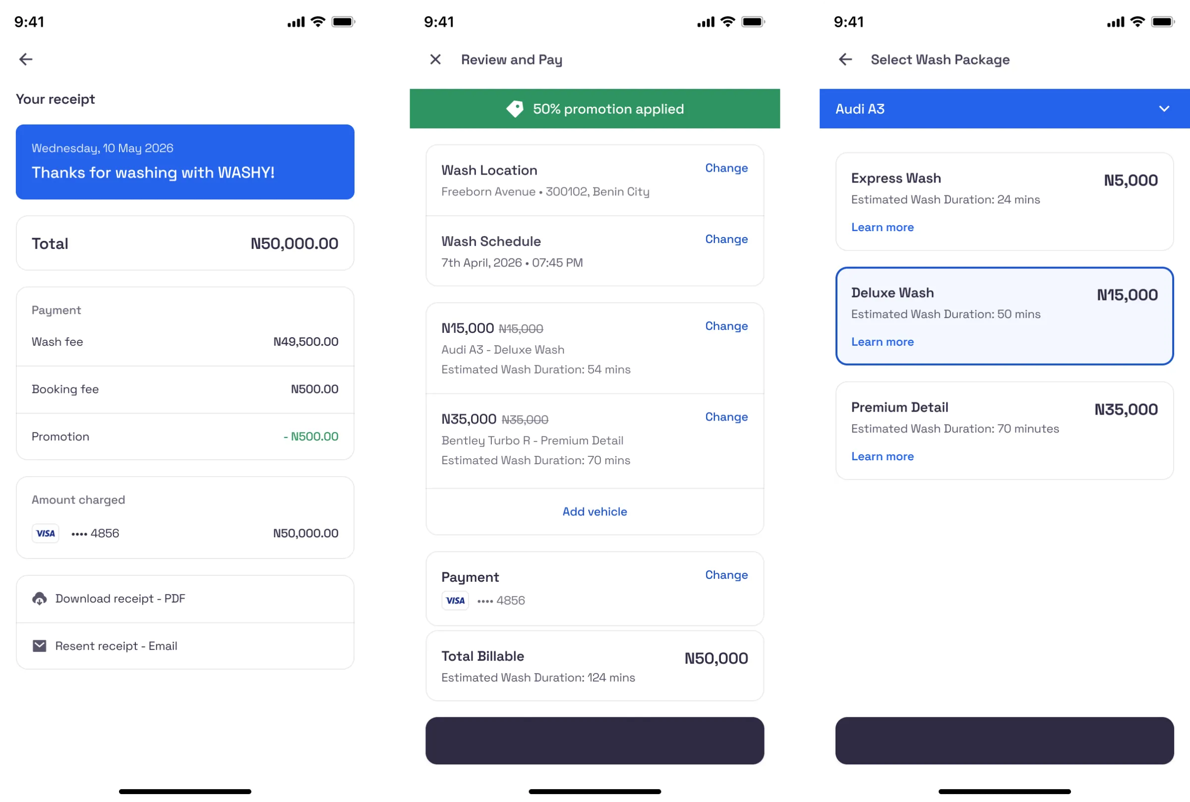
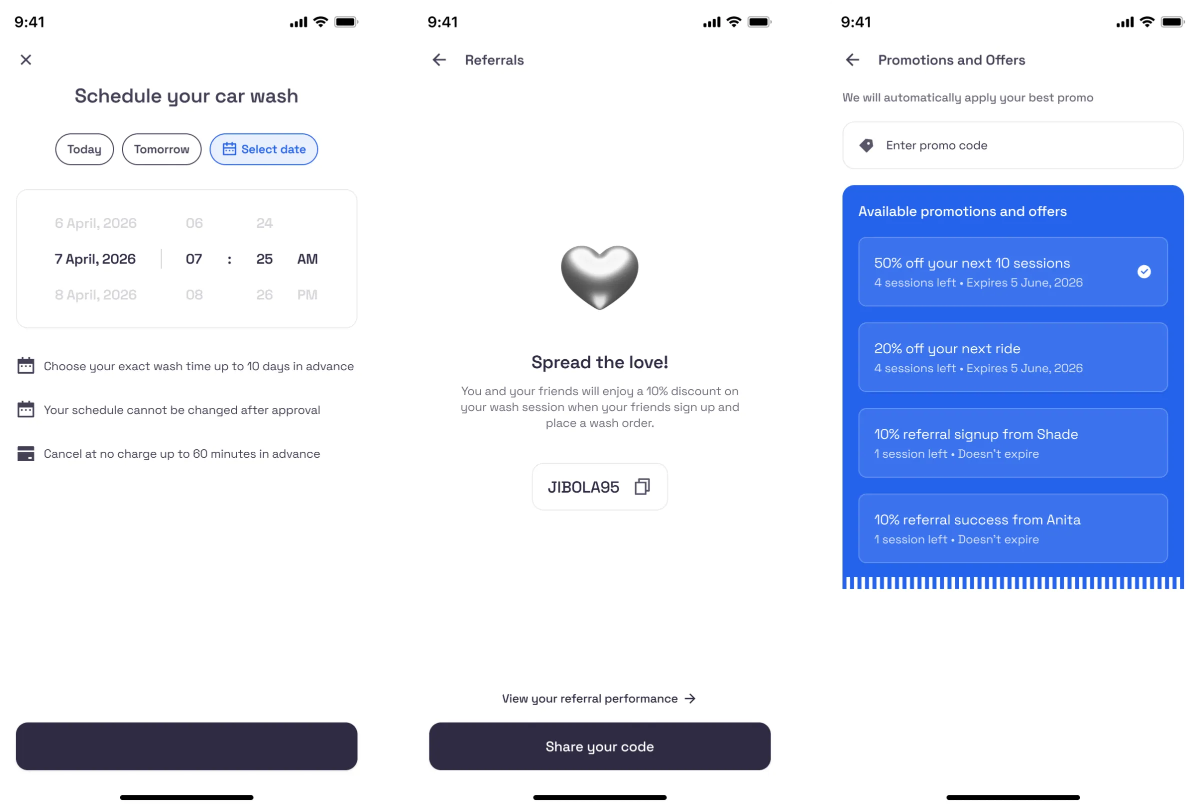
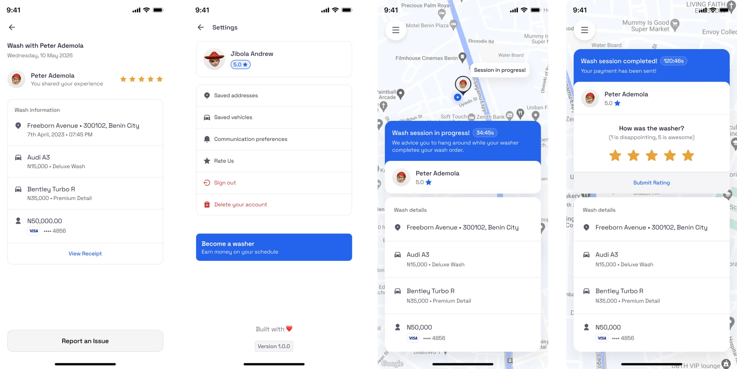
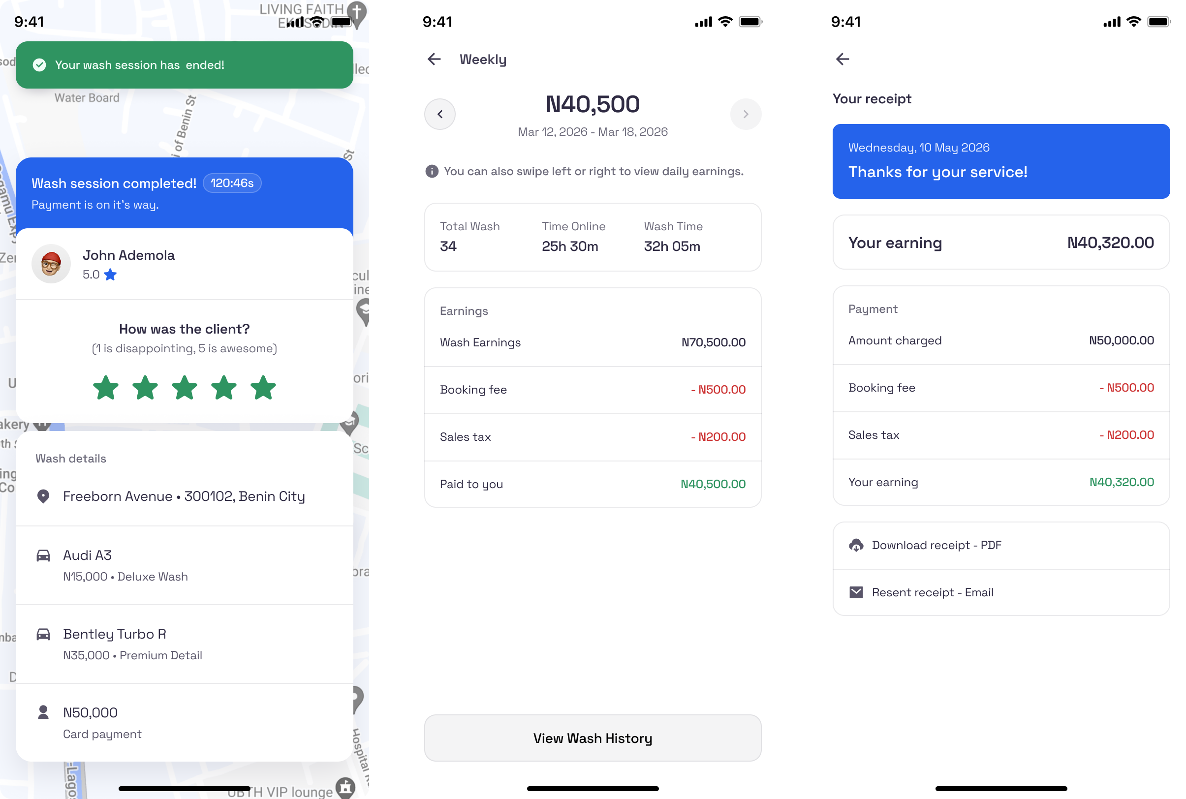
Beyond payouts, I designed the complete journey across both apps, from onboarding and booking through to completing a wash and receiving payment.
The two experiences shared one visual and interaction language while giving each side the information and actions it needed.
Washy for Car Owners: Booking · Scheduled Wash · Payment · Wash History. Washy for Car Washer: Incoming Job · Earnings · Scheduled Wash · Wash History.
img 1 of 5
Reflection
The most important decision happened before the interface
This project taught me to treat research as part of the brief, not as a box to tick.
Had I gone straight into the screens, I might have designed a perfectly polished earnings page and missed the problem that mattered most. The most valuable decision was not visual. It was recognising which finding applied to the people I was designing for, then showing why solving it could also make sense for the business.
That lesson stayed with me: some of the strongest product decisions happen before the interface takes shape.