Making the case for constraint

Reducing the decisions inside a website builder so educators could focus on their courses, not the mechanics of building the site.
ECOLMS is a B2B learning platform, and the Site Builder lets educators create their own course websites. I designed the experience end to end, from the editing model and block system to the sidebar controls and templates.
At the centre of the work was a design hypothesis: educators would value a sound, professional course site more than granular control over every part of its layout.
The problem
A blank canvas makes educators do the designer’s job
The default website-builder model is to expose more control: more positioning, more styling, and more ways to change the page.
That freedom can be useful when the person building the site understands layout, responsiveness, and visual hierarchy. But ECOLMS is made for educators whose primary goal is selling courses, with the website there to support that. They need to publish a course site that looks credible and works across devices, not spend an afternoon adjusting alignment and breakpoints.
A blank canvas doesn’t feel like freedom to someone who never asked to become a web designer. It feels like homework.
The real design question wasn’t how closely ECOLMS could imitate other builders. It was how much freedom was genuinely useful, and when more freedom simply introduced more ways to break the experience.
The approach
So I designed the freedom down, not up
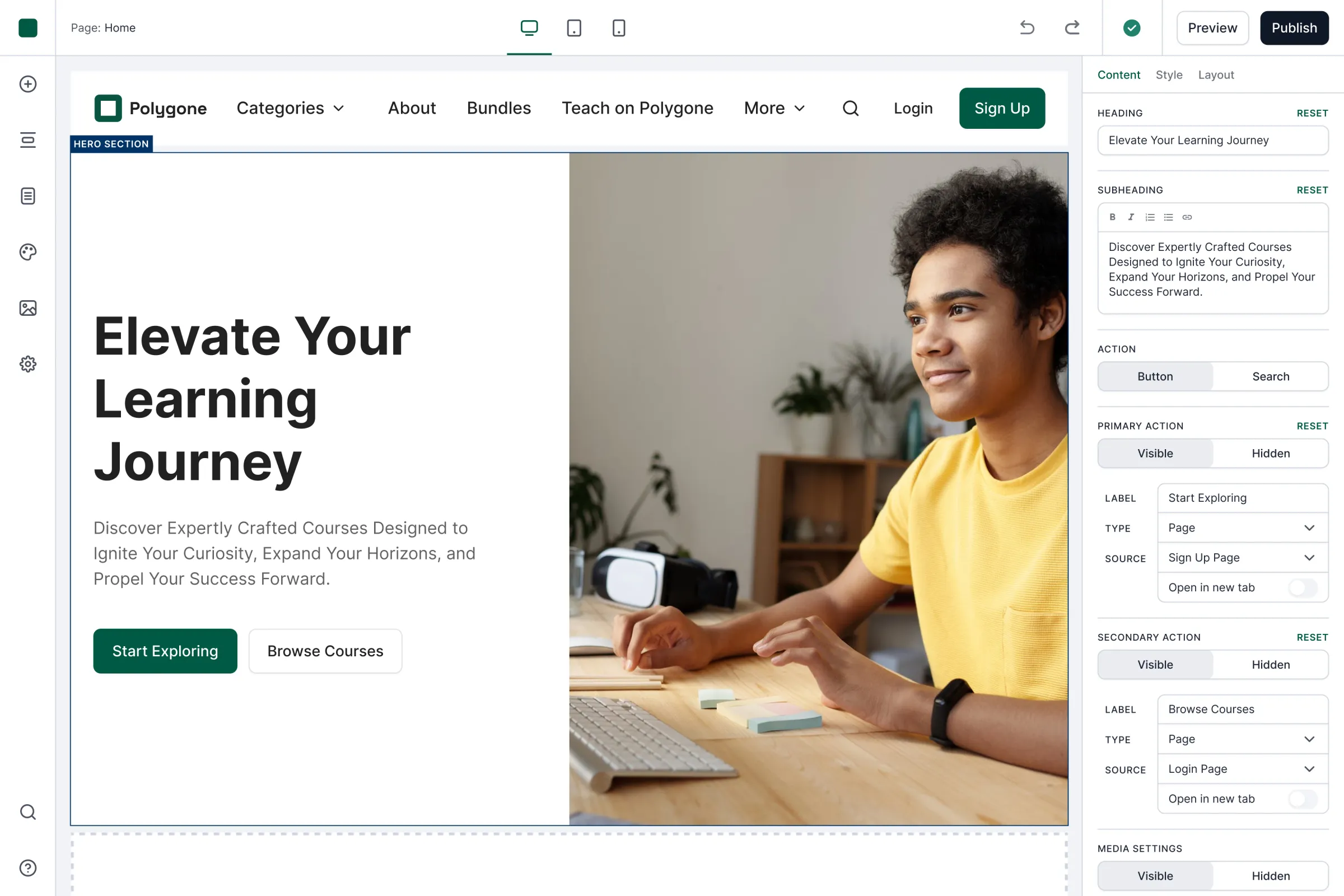
Rather than editing freely on the canvas, users select a block and adjust it through the sidebar. The canvas shows the result, while the sidebar holds the decisions available for that block.
Educators cannot move a heading a few pixels off the grid or create a layout that breaks on smaller screens, because those decisions are handled by the system. They control the parts that belong to them: their content, imagery, colours, and the blocks they choose to include.
The canvas shows the result; the sidebar holds the decisions. Educators edit meaning, not geometry.
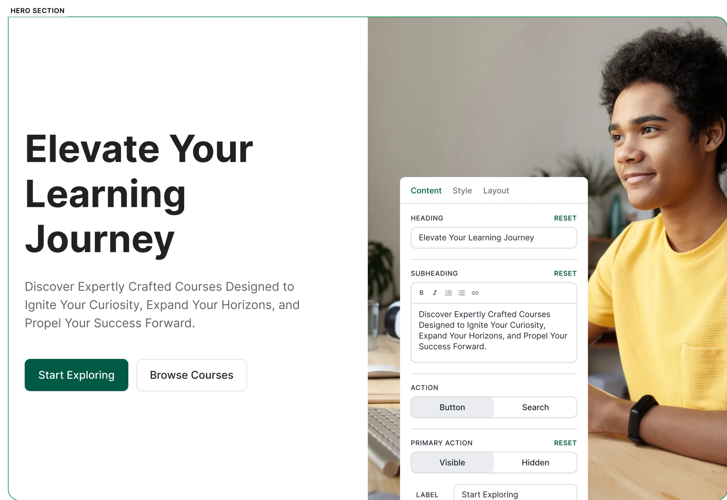
The colour system follows the same principle
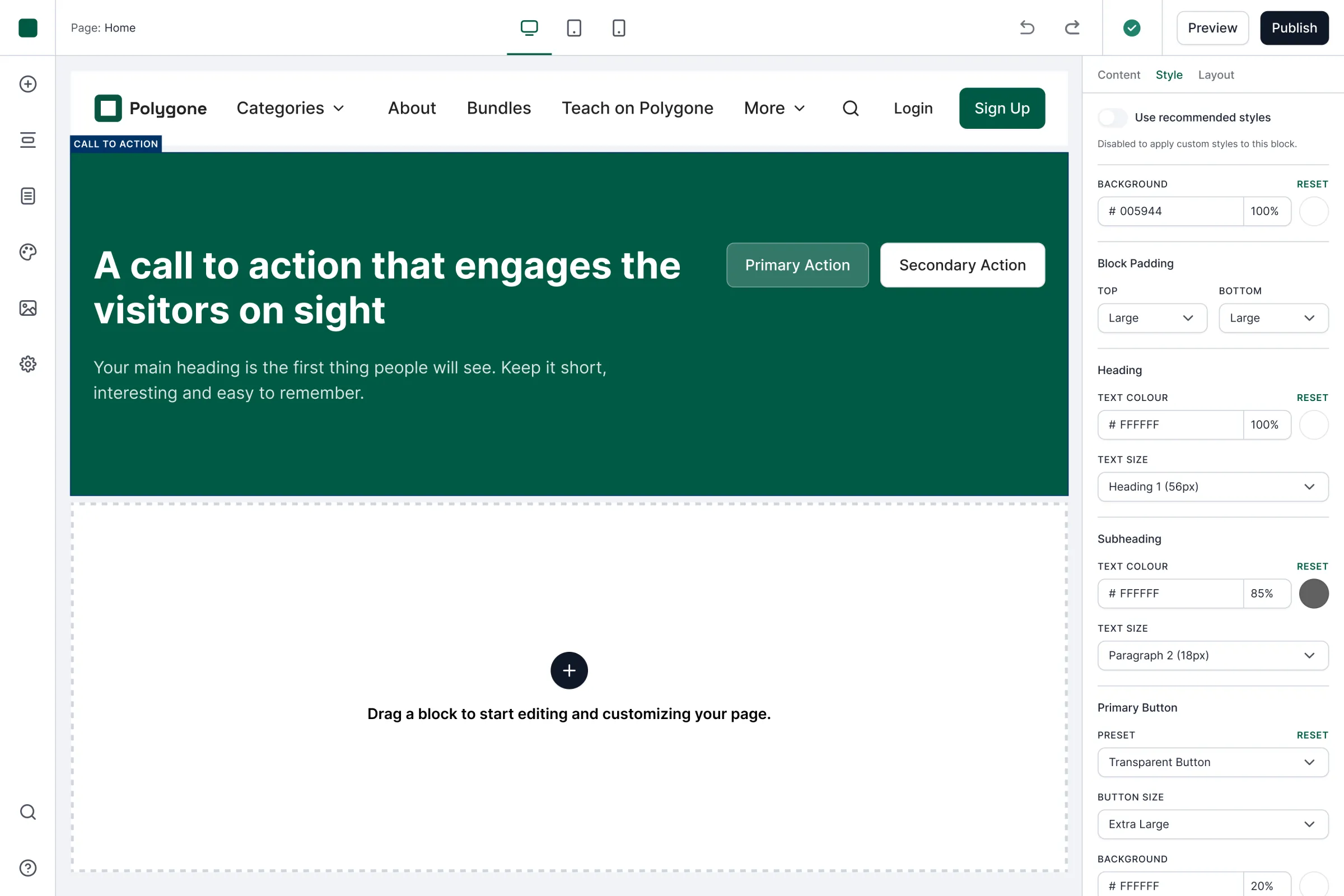
Instead of giving every element its own colour picker, the builder generates a palette for the entire site. Changing the palette updates every block while preserving consistency. It’s a smaller decision surface on purpose.
It didn’t lock anyone in, either. Every block followed the palette by default, but an educator could switch off the recommended styles and tailor a single block on its own — coherence you got for free, and control when you actually wanted it.
One palette drives the whole site — and any block can still break from it on its own.
img 1 of 3
Every block
Every block speaks the language of its content
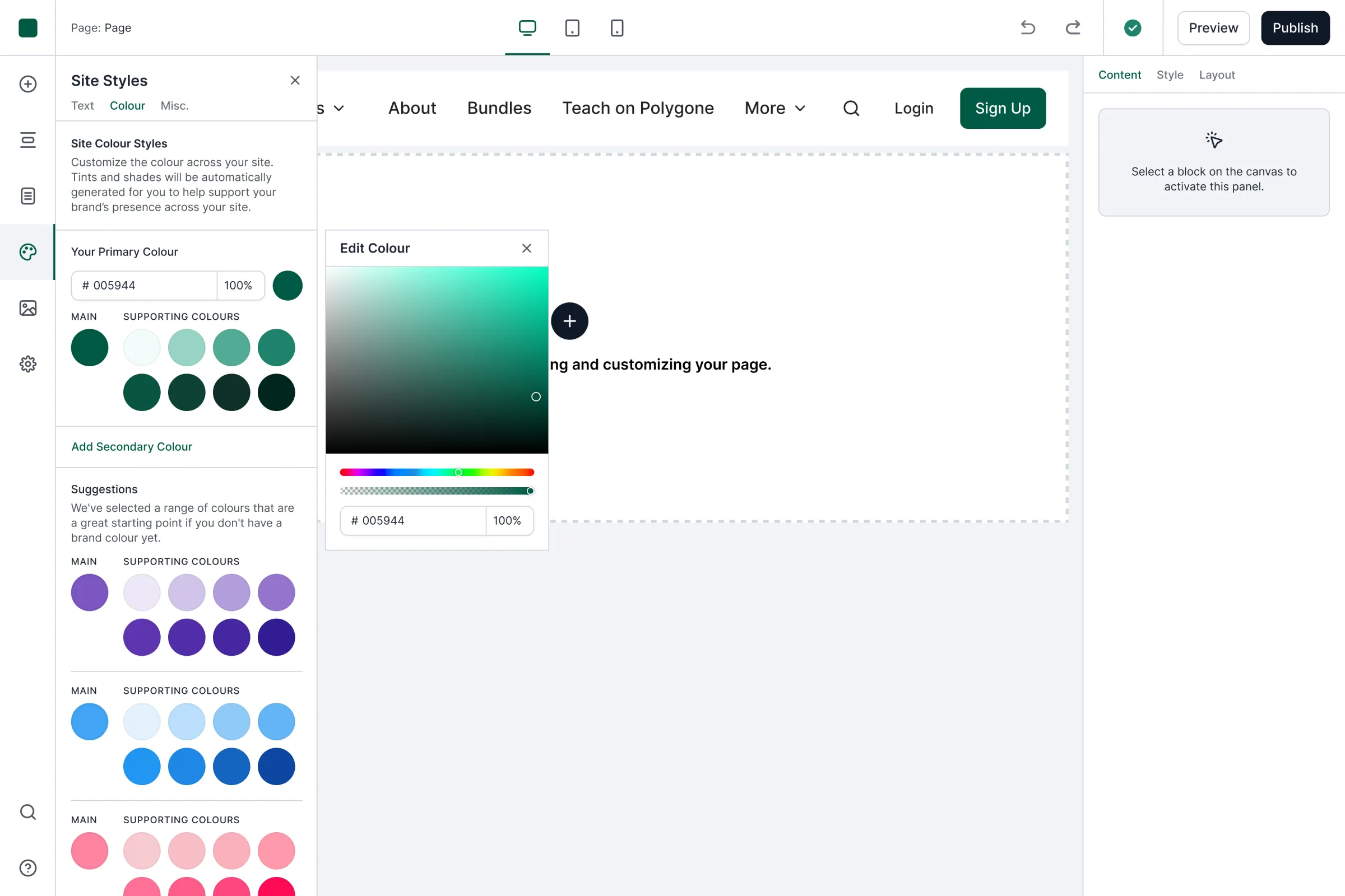
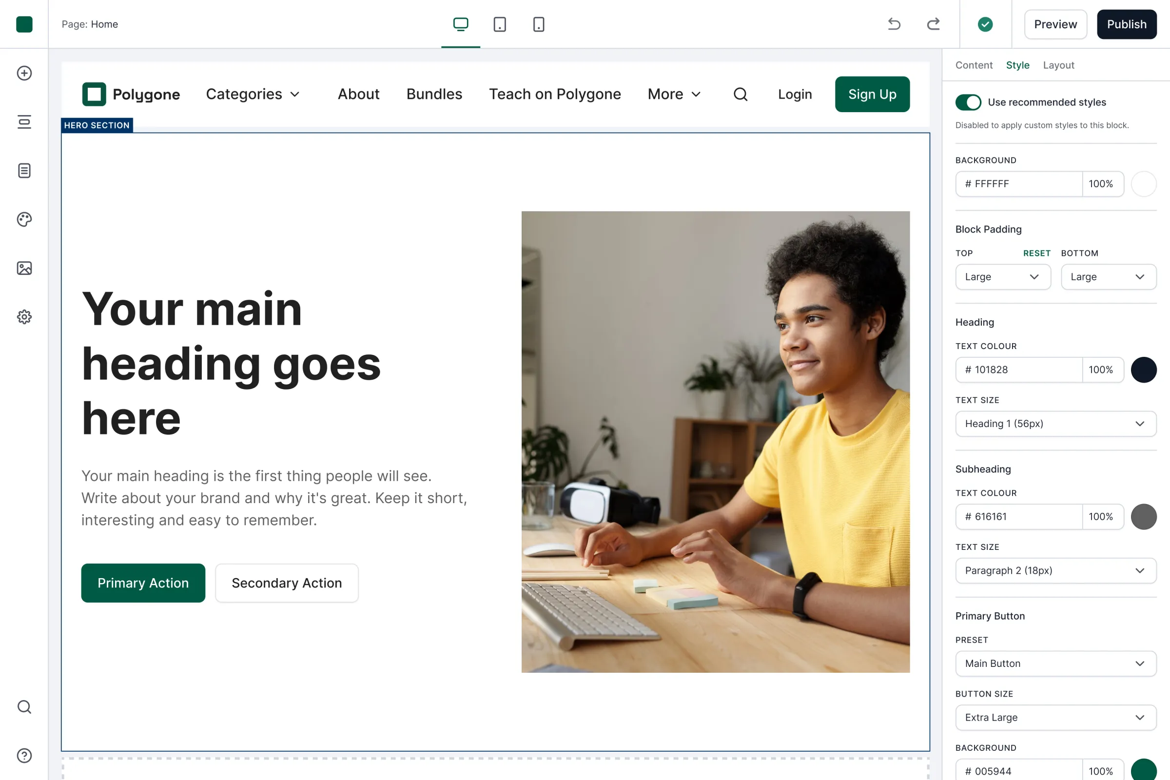
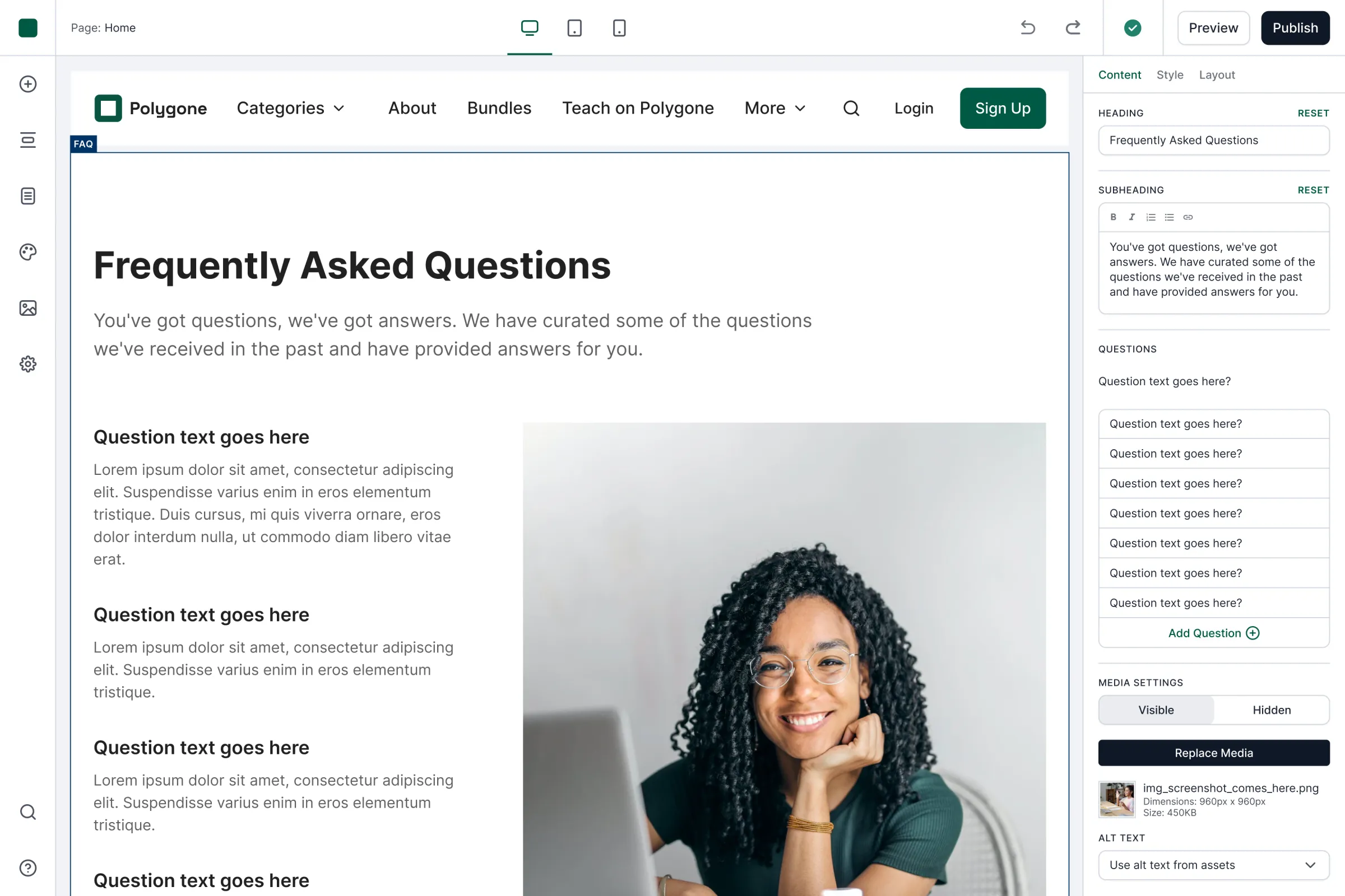
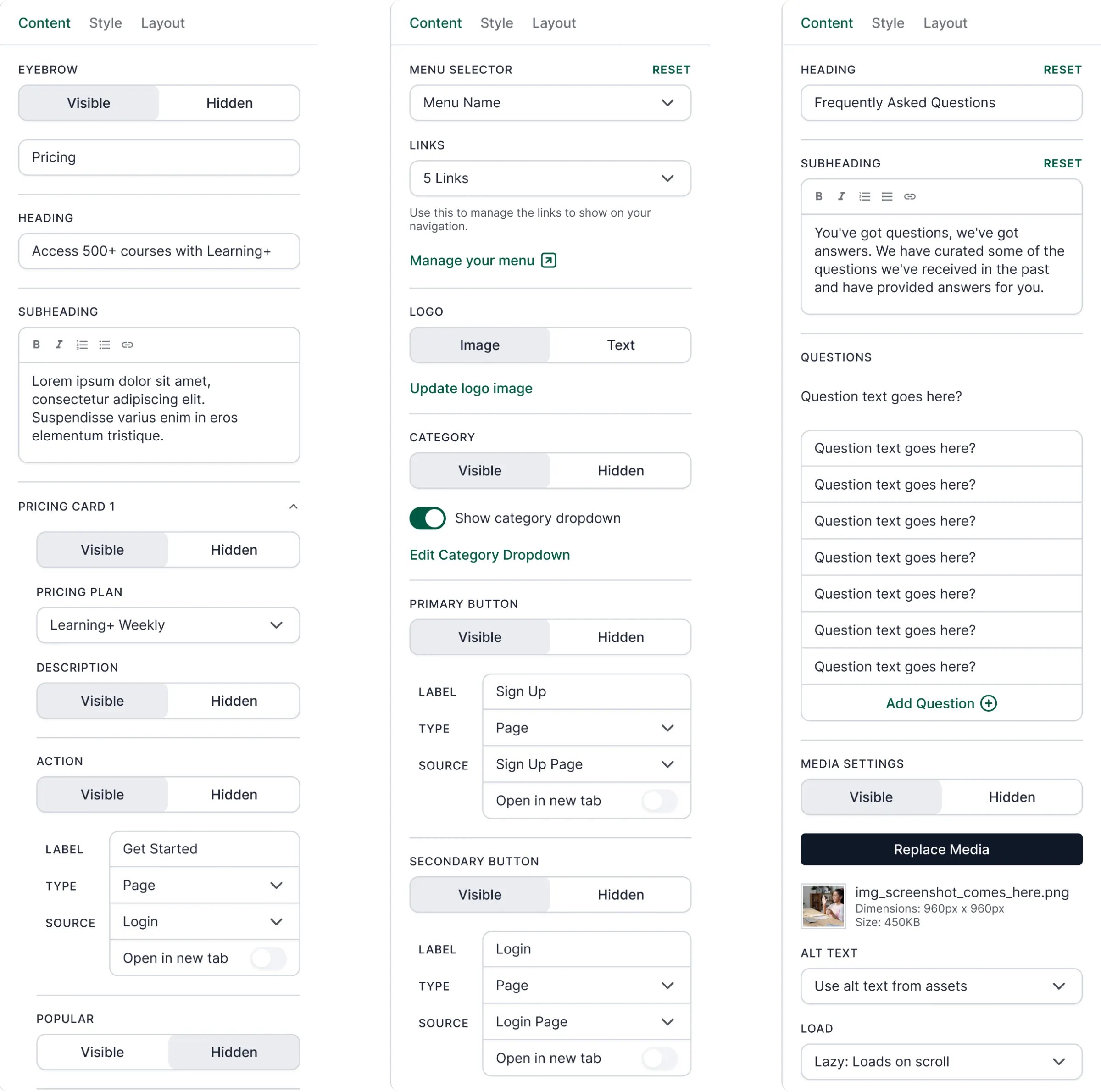
This is the part that took the most work. I did not create one generic settings panel and reuse it across the builder. Each block has a specialised editing panel written around the content it holds.
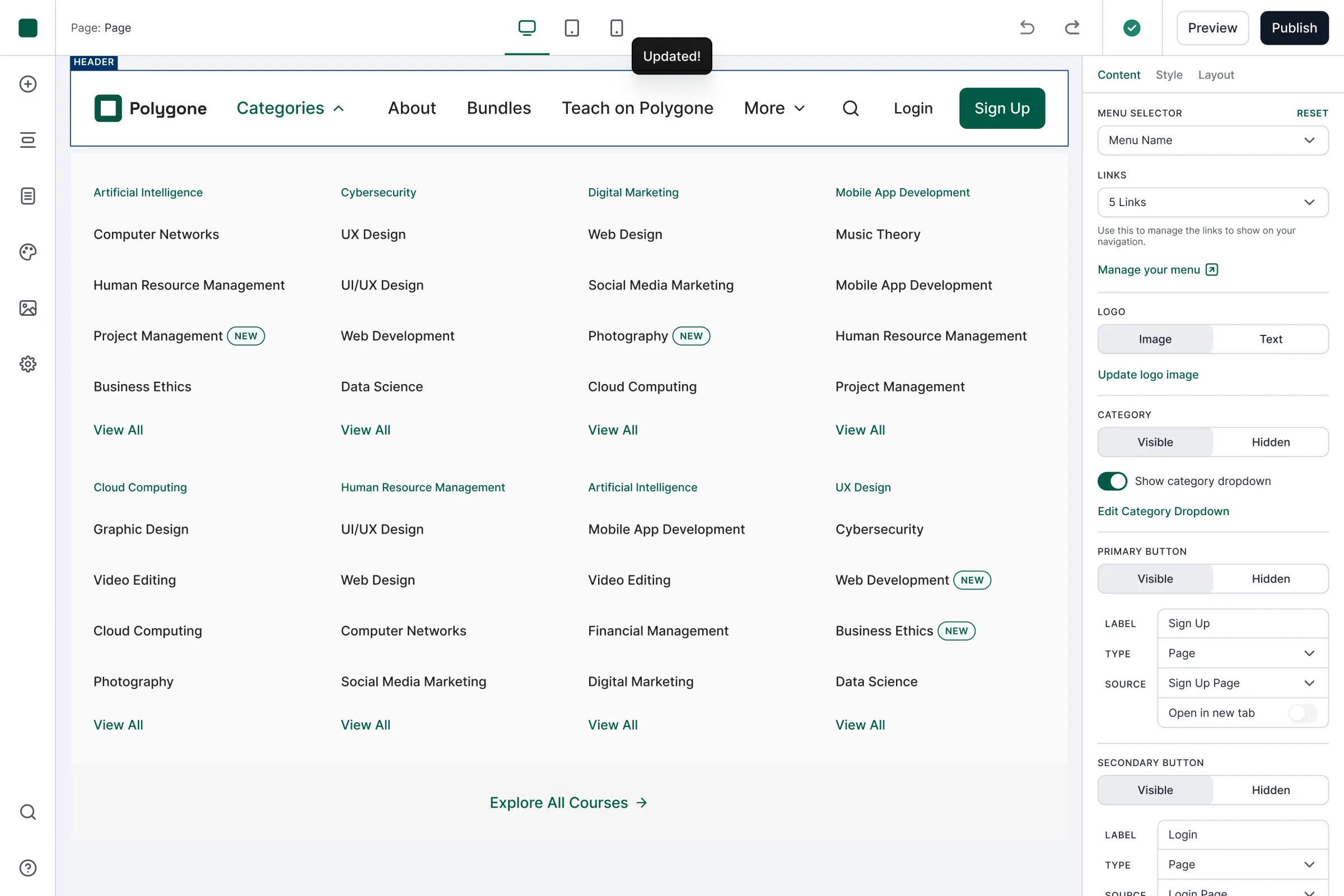
The navigation block does not ask educators to manage “components” or “elements.” It gives them controls for their menu, links, logo, categories, and primary action. The hero block has its own variants and settings. Other blocks speak in terms of courses, instructors, authors, student reviews, and frequently asked questions.
I defined the blocks, the controls within each panel, and the language used to describe them. I built the editor panels as a component system in Figma, so each block could carry specialised controls without the system losing consistency as it grew. The machinery stays underneath the interface. Educators only see controls that speak about their content in terms they already understand.
Each block, its own panel and vocabulary. The consistency is under the hood; the surface speaks the educator’s terms.
img 1 of 4
Built for teaching
Built for teaching, not generic websites
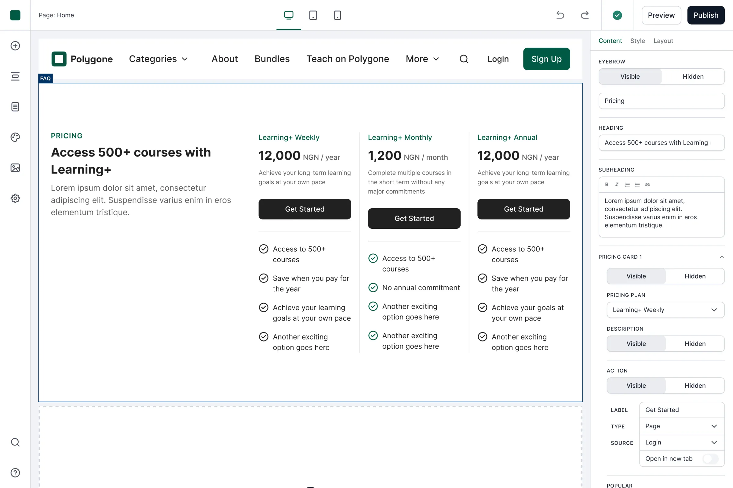
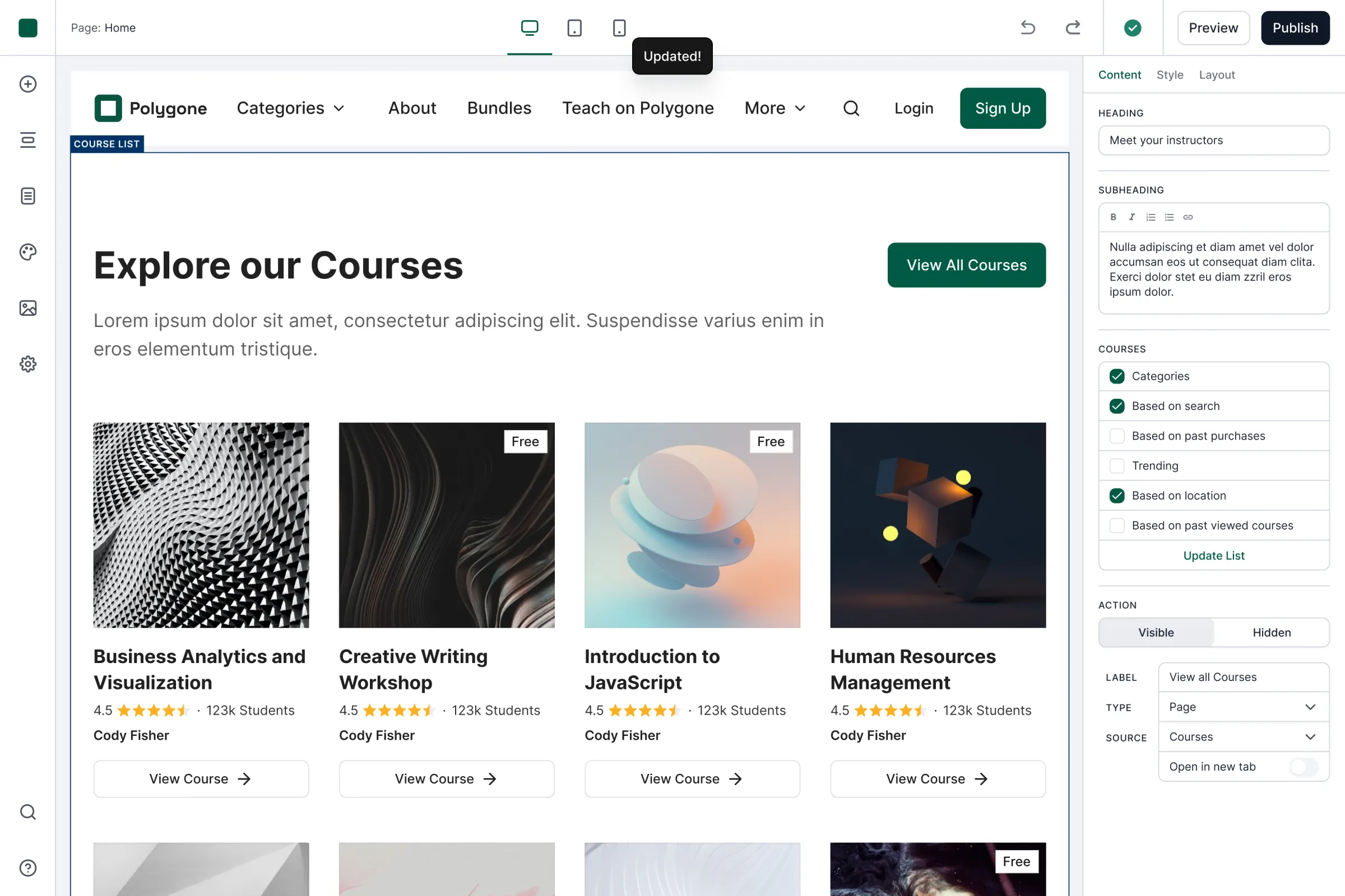
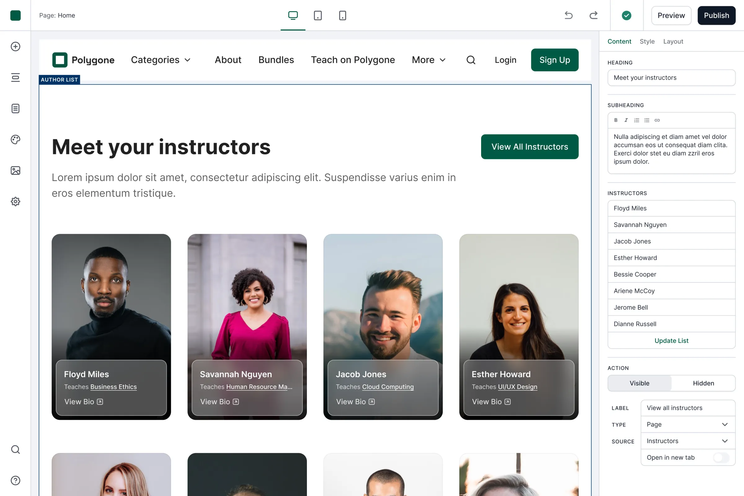
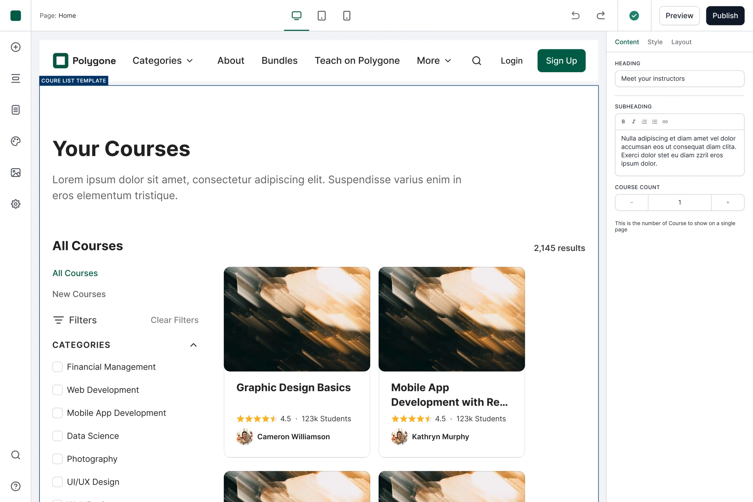
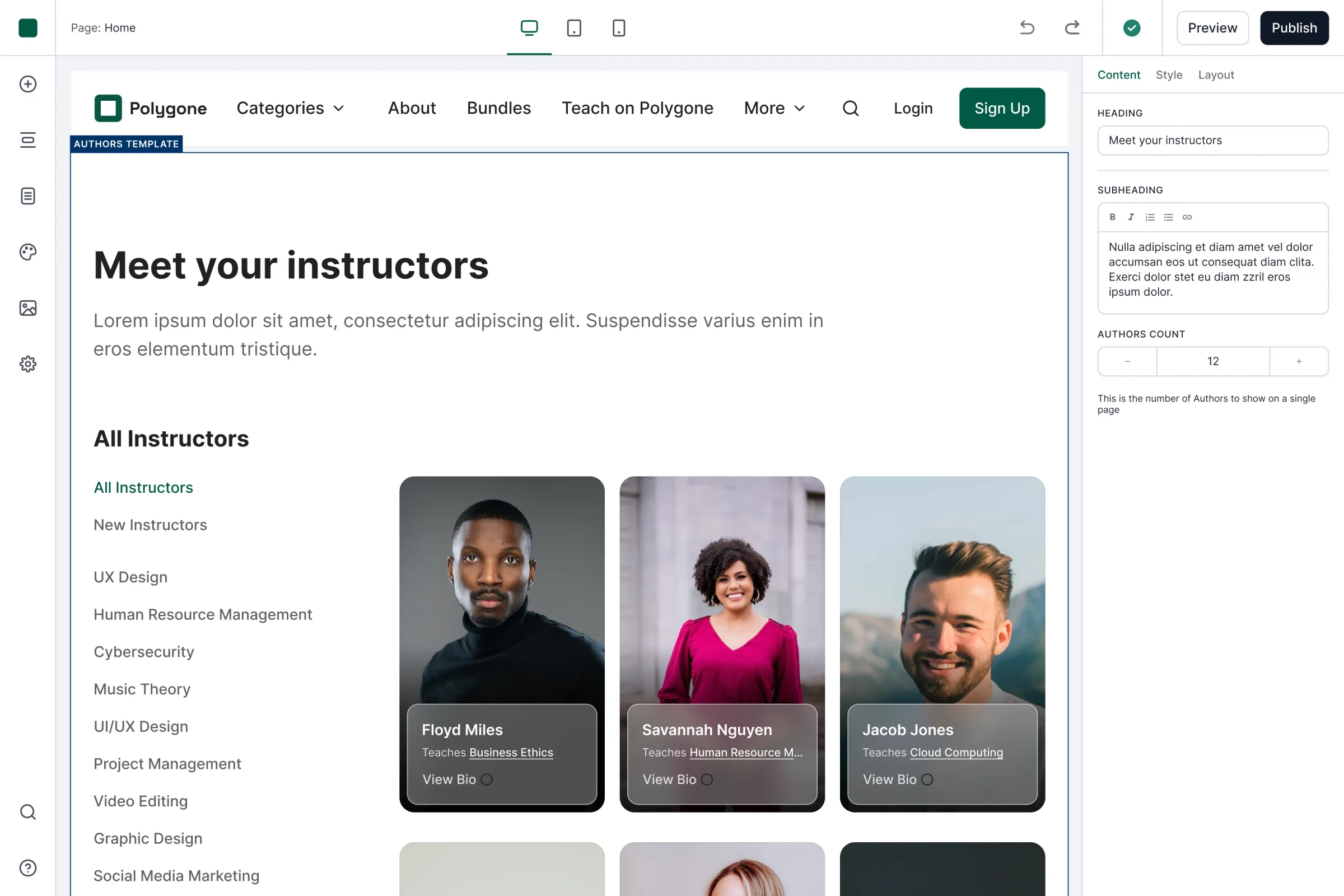
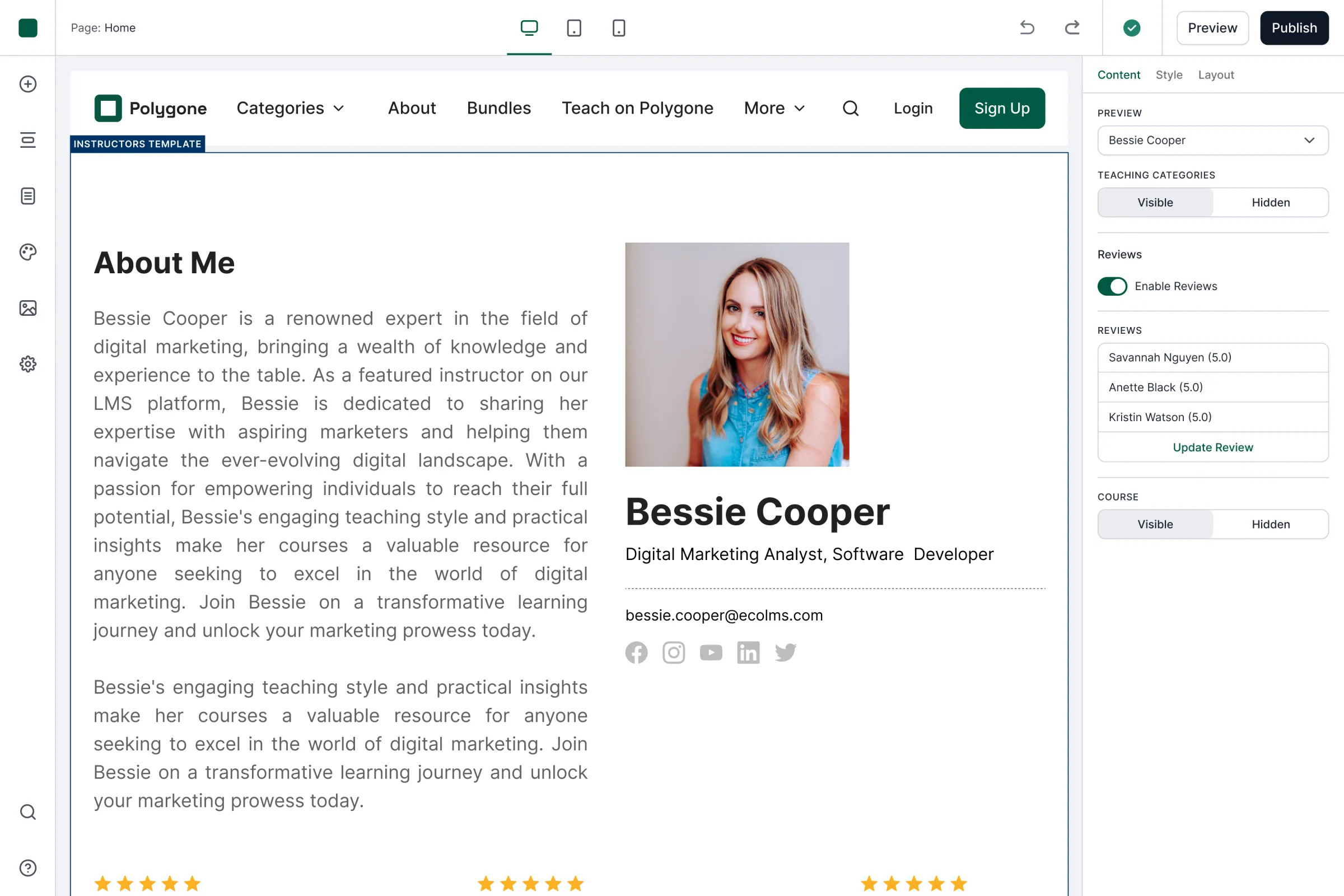
Because ECOLMS is a learning platform first, the builder includes blocks that a general-purpose website tool might not prioritise: course lists, instructor profiles, author lists, student reviews, and other education-specific content.
The templates show how those blocks work together as complete course sites. Instead of beginning from an empty page, an educator starts with something coherent and adapts it to their content.
Course lists, instructor profiles, reviews. Pieces built for a course site, not marketing blocks bent into shape.
img 1 of 5
Reflection
Constraint was the feature
The project stopped before launch, so its central hypothesis was never tested with real educators: would they experience the reduced control as relief, or as restriction?
In hindsight, I would validate that before building out the full block library. A lightweight prototype containing one template and a small set of representative blocks would have been enough to test whether educators could create a credible site, understand the sidebar editing model, and still feel they had enough control over the result.
I would test the palette system especially closely. It’s where deliberate constraint is most likely to become frustration for someone trying to match an existing brand. I would also test whether people expected to edit content directly on the canvas rather than through the sidebar.
Only after validating those foundations would I scale the system into the complete set of blocks and controls. But I would make the core bet again: educators building a course site are better served by a smaller set of sound decisions than by infinite control. The strongest part of the builder is not everything it lets them change, but everything they never have to worry about.