The report a recycler hands to a lender

How I redesigned Circula’s reporting page so a recycler could turn a season of work into a story anyone could read.
Circula helps recycling plants in Nigeria track what they pull off the waste stream, what they process, and what it’s worth. This is about one screen: the report a recycler shows the people who fund them.
Where it landed
The page now turns a season of work into a story both sides can read
A recycler picks a window of time, and the page tells the story of the work they did in it: what they pulled from the waste stream, what it kept out of a landfill, what it meant for the air and the people they employ. Plain enough that an operator with no climate background can read their own impact; grounded enough that a lender who’s never set foot in a plant can tell whether it’s worth backing.
5
Plants ran their reporting on it
100+
Exported reports, up from zero before the redesign
5
Recyclers used it to help secure funding
The part I was proudest of isn’t on the screen. We cut it, and I agreed to ship without it. Here’s how the page got there, and how its best idea didn’t survive.
The problem
The old page just repeated numbers you could already find elsewhere
Every figure on the report already lived on its own screen in the product. As a one-stop summary it was fine, and that was its ceiling. On early demo calls it showed: operators weren’t sure what the report was even for. We’d explain it was a way to see how their business was doing, and they’d nod that they got it, but their faces asked “why?”
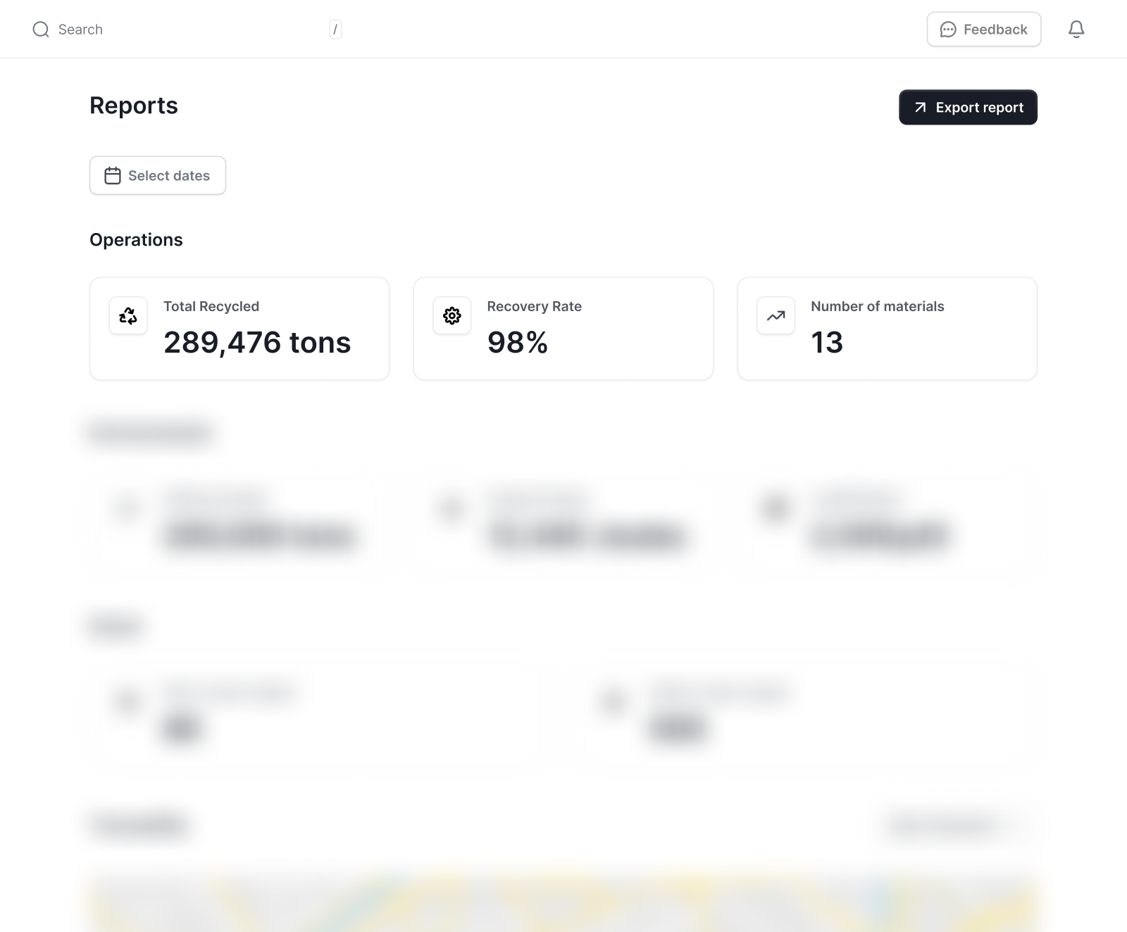
The impact numbers meant nothing to the operators reading them
You don’t need a formal education to run a recycling plant. These are operators who know their materials and machinery inside out, not carbon accounting. The operations metrics mostly landed; the tons they understood. But everything past that, the environmental and social figures, drew the same question every call: what does this number actually mean? “176.8 MTCO2” is just shapes to someone who was never handed a way to read it.
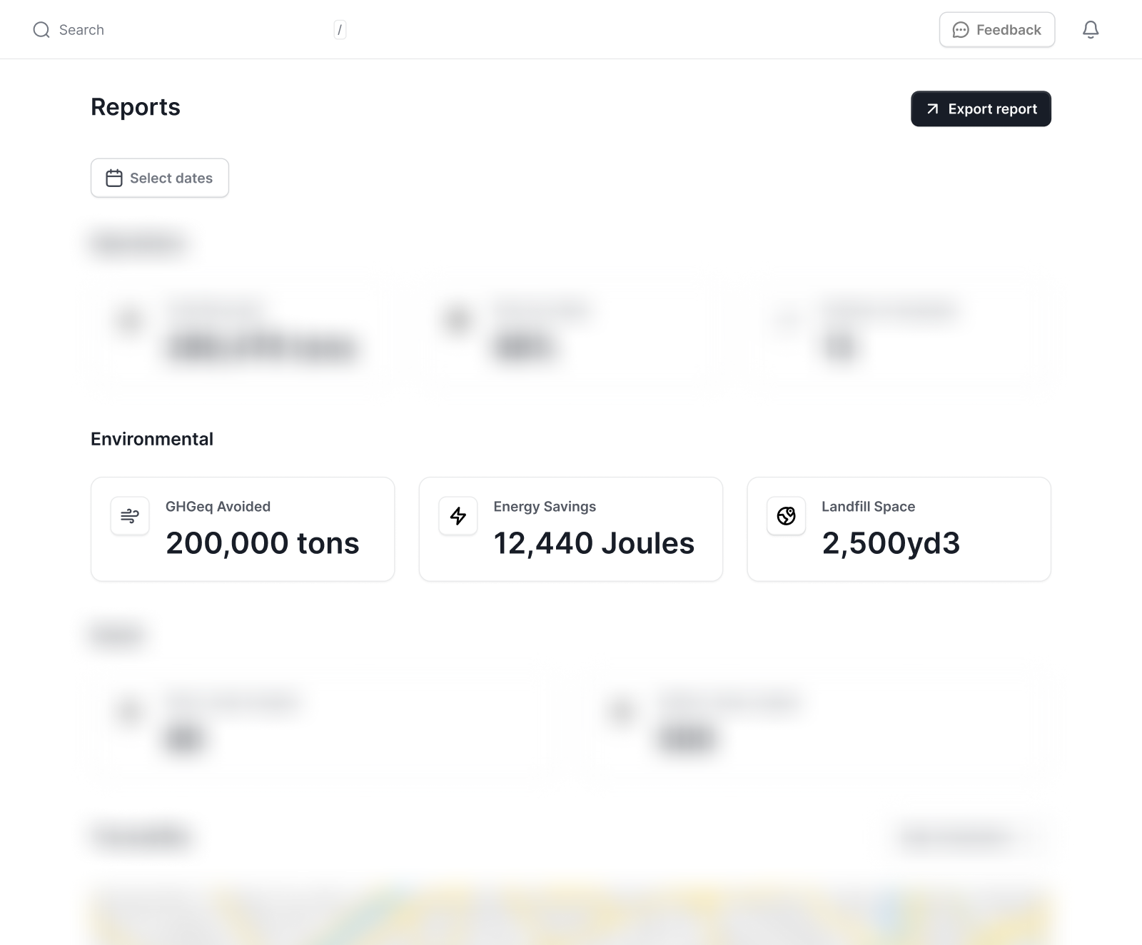
Lenders couldn’t read the numbers either, from the other side
Most lenders we spoke to aren’t in recycling either, so “you moved ten tons” reached them with no sense of scale. Is that a lot? They didn’t want the number. They wanted to know what it amounted to, and whether it was worth backing. Anyone can claim they moved ten tons.
How might we turn raw numbers into a story a recycler with no climate background can read, and a lender with no recycling background can trust?
The reframe
The page had to stop summarizing and start telling a story
The job changed from storing every value to carrying one window of a recycler’s work, built so they could show it and someone else could follow. After that, every element had to answer one question: does this help tell the story, or just add to the pile?
The misstep
I added a chart before I had a reason for one
The operations section was a wall of flat numbers, so I put a row of small bars under them. They’d add context, I told myself, and a little color to a page that had none. The honest order of events: I liked how they looked first, and went hunting for the justification after.
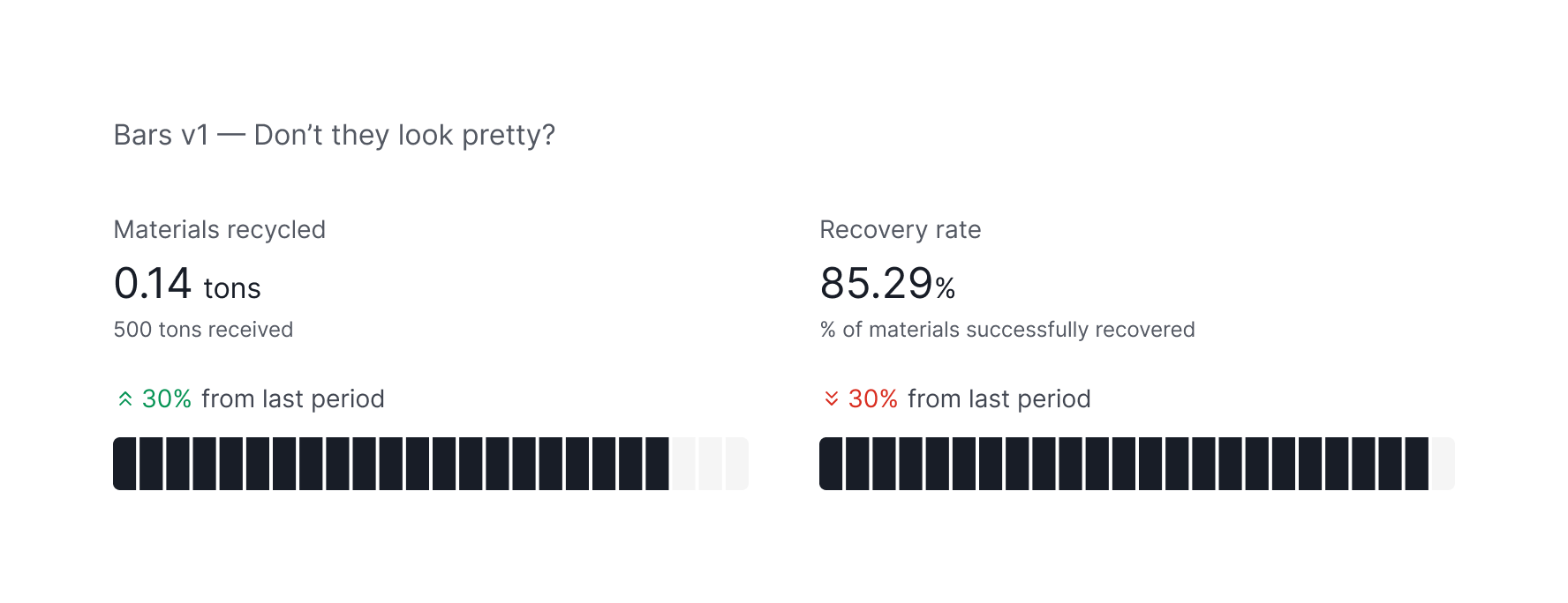
Nobody could read it. On its own, the people I showed it to said it looked great, which was just my own bias handed back to me. In review it fell apart. People saw it for the first time and asked what it was showing, and the ones who’d seen it before asked again the next call.
When the people who built a thing keep forgetting what it’s for, the thing is the problem.
And every time I answered the question, the answer was the same: the bar was redrawing the recovery rate, a figure already sitting a few blocks away. I tried to give it a real job, measuring each period against the last so the bar showed direction instead of repeating a number. It worked on paper. The redundancy was gone. The bar finally had a job the recovery rate wasn’t already doing. But in fixing that, I’d opened a new one, a problem I wouldn’t feel until I’d lived with the chart a while.
The ending I’d rather tell than bury
We cut that chart, and I agreed to ship without it
The new chart never sat still. Because the stronger period set the ceiling, the reference moved from one view to the next, and the reader had to relearn it every time. The shape wasn’t the expensive part. The shifting ground under it was. The product already asked a lot of the Nigerian recycling industry, and one more thing to learn was one too many. So it came out.
Choosing what earns a number
The material mix leads the page now, because it frames every number after it
“You moved a thousand tons” doesn’t land until you know a thousand tons of what. So the material breakdown stopped being a strip tucked under a count and became the first thing on the page (this period, more plastic than paper), and every number after it reads against that.
Then I rebuilt the operations row around numbers that explain each other
The old row leaned on a bare count and a recovery-rate percentage with its inputs out of sight. I replaced them with three figures that build on one another: waste recovered (what the plant pulled from the environment), materials recycled (how much of that it processed), and recycling efficiency (what the two make together). The percentage stopped floating. Now you can see the figures behind it.
The real fix
Every number became something a person could picture
“176.8 MTCO2” means nothing to someone who doesn’t think in tonnes of carbon, which was almost everyone reading. So I translated each figure into something they already hold in their head: CO2 avoided as trees planted, energy saved as homes powered for a year, landfill spared as dumpsters kept off the curb. The social numbers got the same treatment: jobs read as families with a stable income, one of the first things an impact lender looks for.
These weren’t picked off the top of my head. I weighed a handful of equivalences and ran them past an ESG advisor, keeping only the ones that tied a hard number to something an ordinary reader could picture right away. The hardest was carbon, where the honest equivalents were either too abstract to feel or quietly overstated the impact. Now a recycler who’s never thought about emissions can feel the size of their own work, in units they actually live with.
What it did
A report nobody opened now helps secure funding
Five plants run their reporting on it. Exports went from zero to over a hundred, and the report has been used to help secure funding. That was the point all along: a recycler’s impact, put in terms an outsider could weigh.
“Osaro approaches every project with a sense of ownership. He consistently went above and beyond, ensuring deliverables were completed with exceptional quality and attention to detail.”
 Jimmy ArikaweCo-Founder, Circula
Reflection
Let the evidence settle it, not my attachment to the work
I let go of the piece I most wanted to keep, because the people in front of it kept telling me, mostly by failing to read it, that it asked too much. The hardest work to question is the work you’re proudest of, and that’s usually the work that needs it most.
Craft only counts when it’s aimed at something
I’ll spend real time on whether a color is quietly lying or whether a number reads in one look. But here all of it pointed at one thing: making a recycler’s work readable by the people who fund it.