A little less uncertainty for insurance

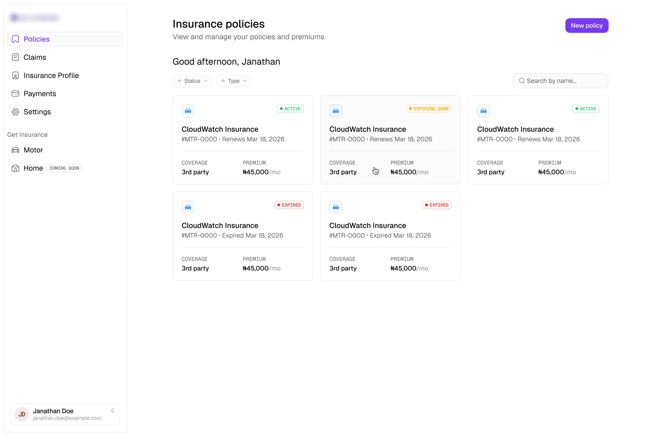
How two product decisions shaped a clearer, calmer insurance experience.
Insurance is high-stakes, full of jargon, and something most people only think about a few times a year. The product promised to get people insured in minutes, not days. My job was to make signing up and handling claims feel calm rather than like paperwork someone would rather avoid.
Over three weeks I designed eight connected flows, from early concepts to dev-ready screens. Two decisions from that stretch are the ones worth writing about. In the first, I was overruled, and I still think the idea had legs. In the second, I overruled myself.
Decision one — Onboarding
I thought onboarding should feel like a conversation
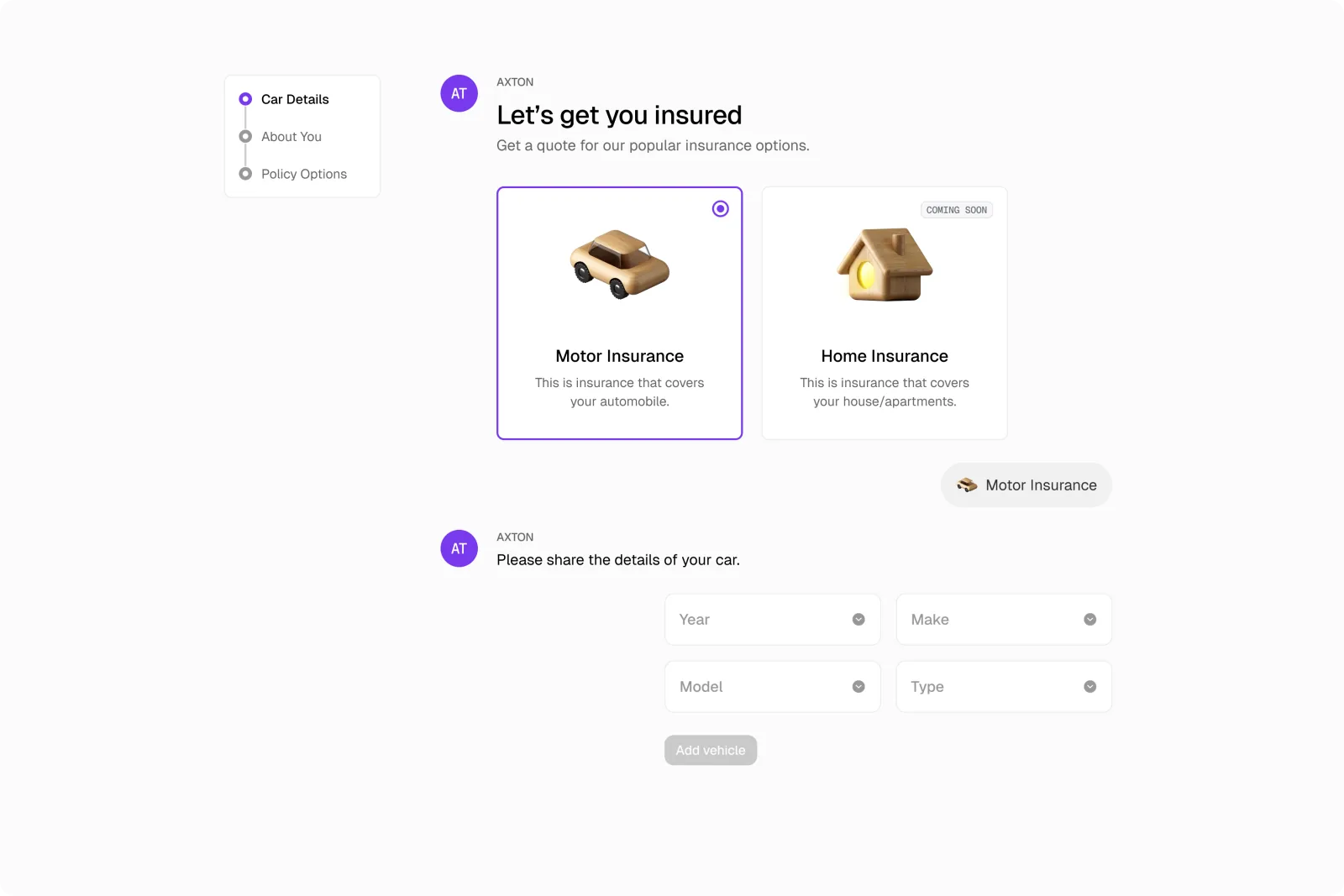
A long insurance intake can feel overwhelming before someone has entered anything. My first version worked as a dialogue: the assistant asked for one thing at a time, answers appeared as messages, and each set of fields only showed up when it became relevant.
Instead of staring at a wall of inputs, people could move through the process one decision at a time.
Conversational onboarding — the flow unfolds as a dialogue and reveals fields in context.

img 1 of 2
The chat felt too unfamiliar for launch, so I kept the clarity and changed the structure
The founders worried that the conversational interface would feel too novel for their audience and create hesitation at the exact moment we needed their trust.
I still believed in the idea, but I understood the risk. Insurance is low-frequency and already a little anxiety-inducing, and even a usable interface can feel less trustworthy when it is unfamiliar.
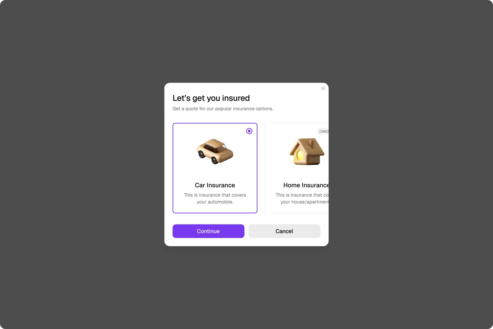
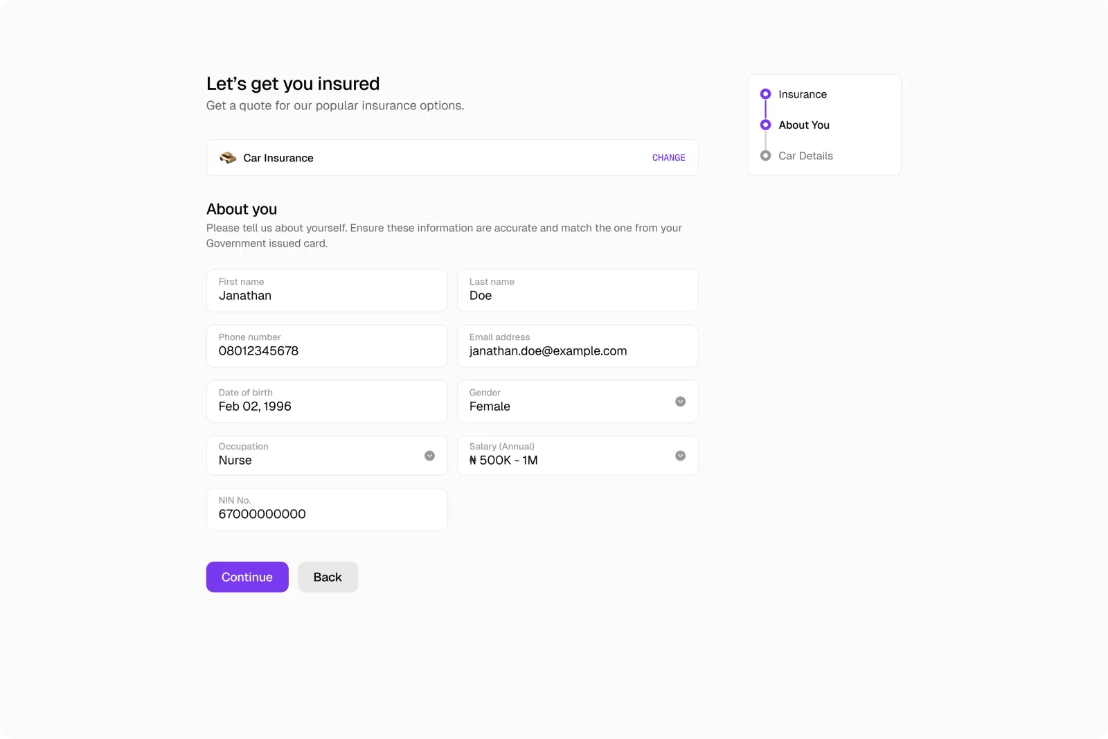
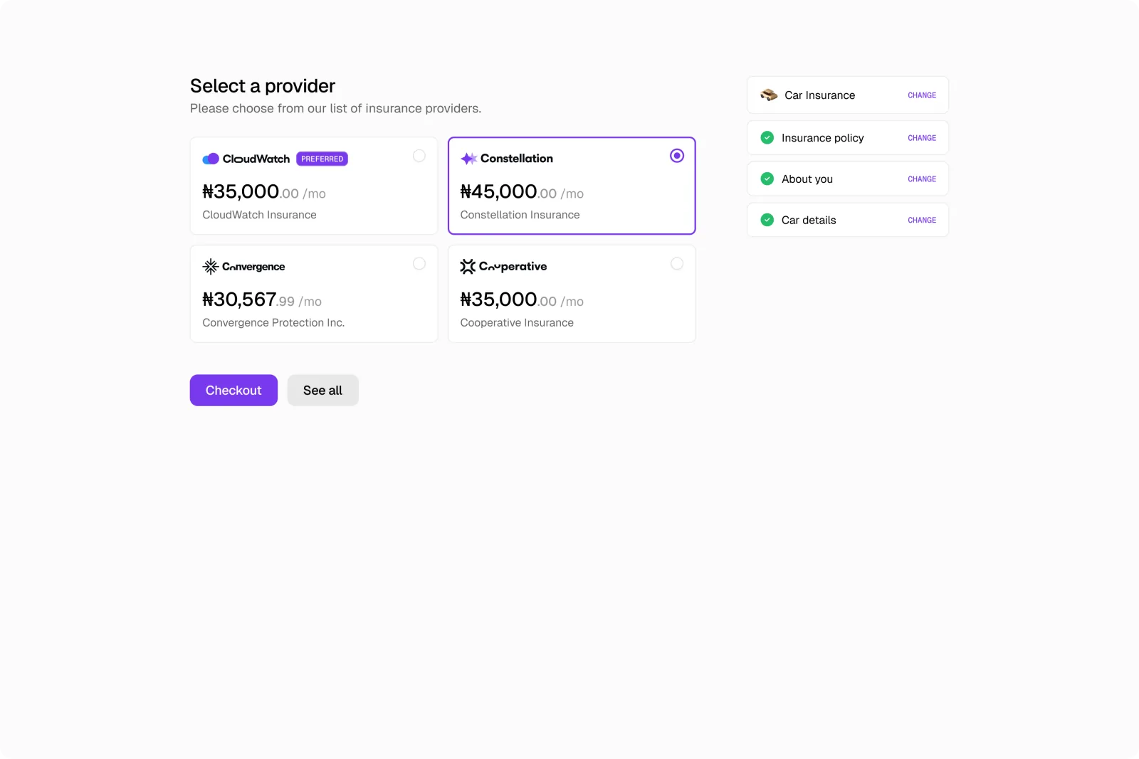
For launch, I replaced the chat with a guided modal and a structured step-by-step flow. I kept what made the original idea useful: focused questions, progressive disclosure, and fields that only appeared when they became relevant. What I dropped was the conversational metaphor.
The shipped version — a guided modal leads into clear, structured steps.
img 1 of 3
Decision two — Claims
I added a progress tracker to make claims feel clearer
Filing a claim is stressful, so my first instinct was to reassure people. I added a progress line to the claims table so they could see how far along each claim appeared to be at a glance.
It looked helpful, and honestly, I was fairly attached to it.
The first version used a progress tracker for every claim.
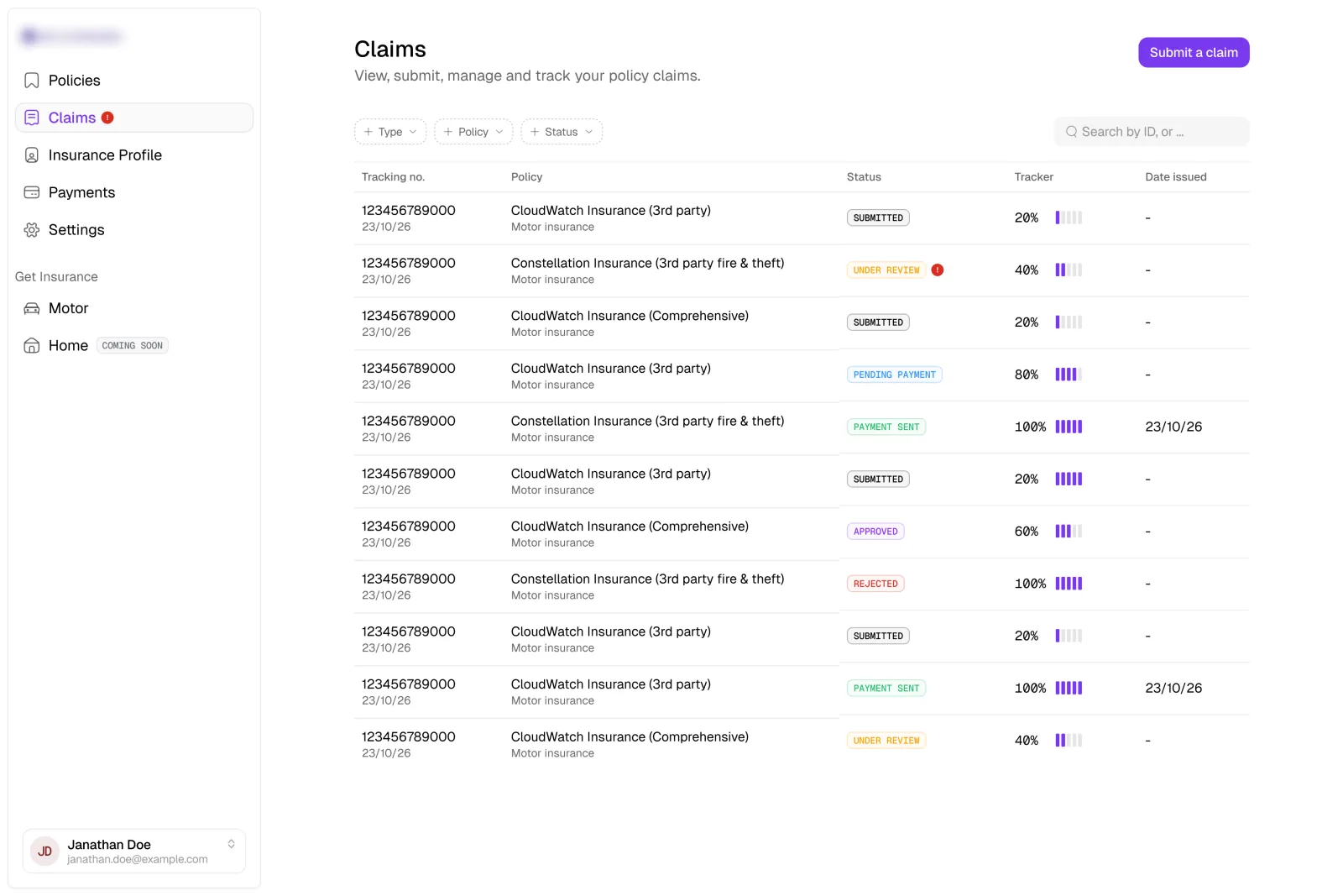
It looked reassuring, but it promised certainty the process could not give
Claims do not always move through a tidy or predictable sequence. A progress bar suggested that every claim followed the same stages and that its position could be measured precisely.
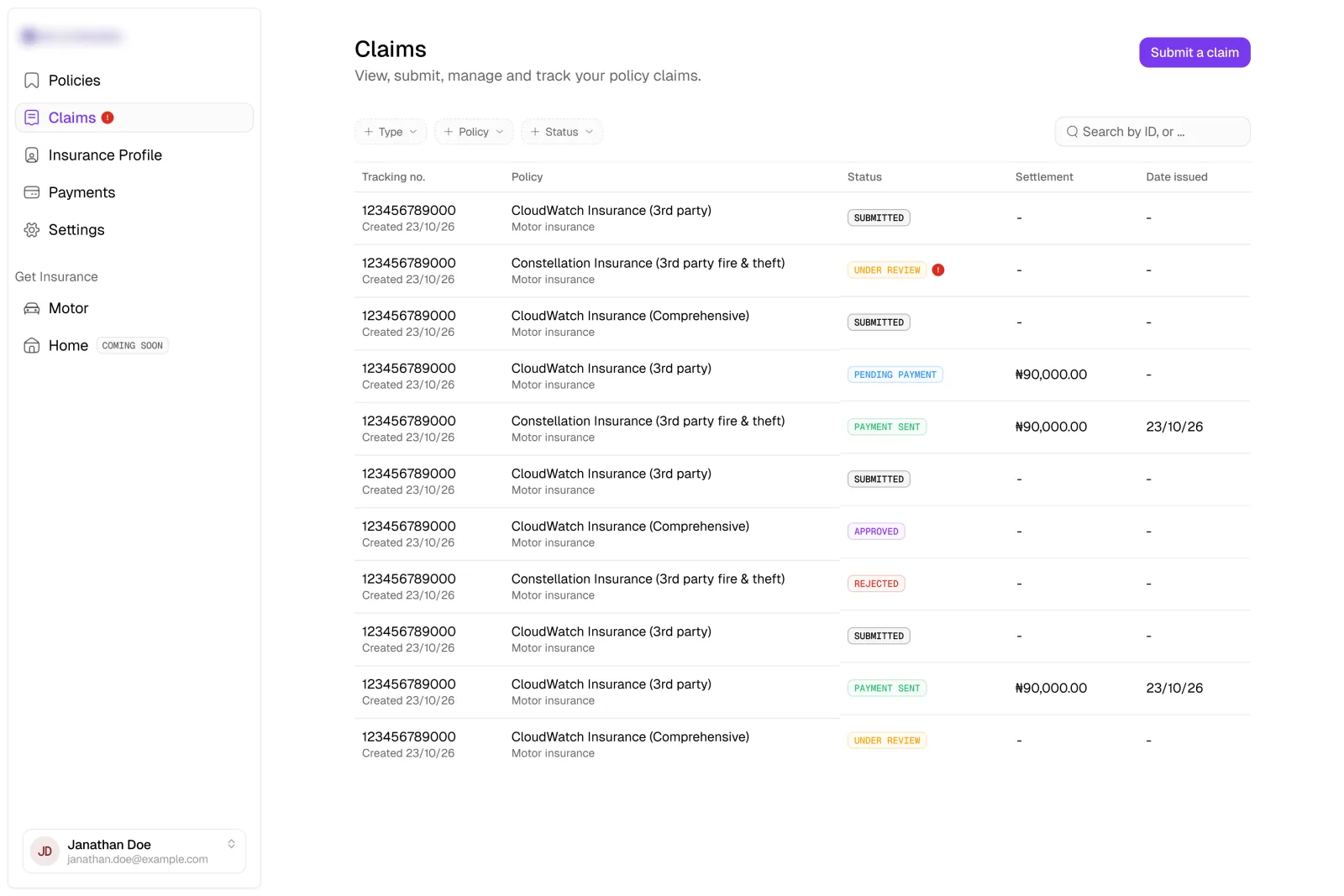
The status label was already answering the “where am I?” question. So I removed the tracker and gave the space to the settlement amount instead, which was the number people were more likely to be anxious about.
The shipped version leads with status and settlement amount: what is happening, and how much is involved.
Something can look reassuring and still send the wrong signal.
What shipped
Eight connected flows in three weeks
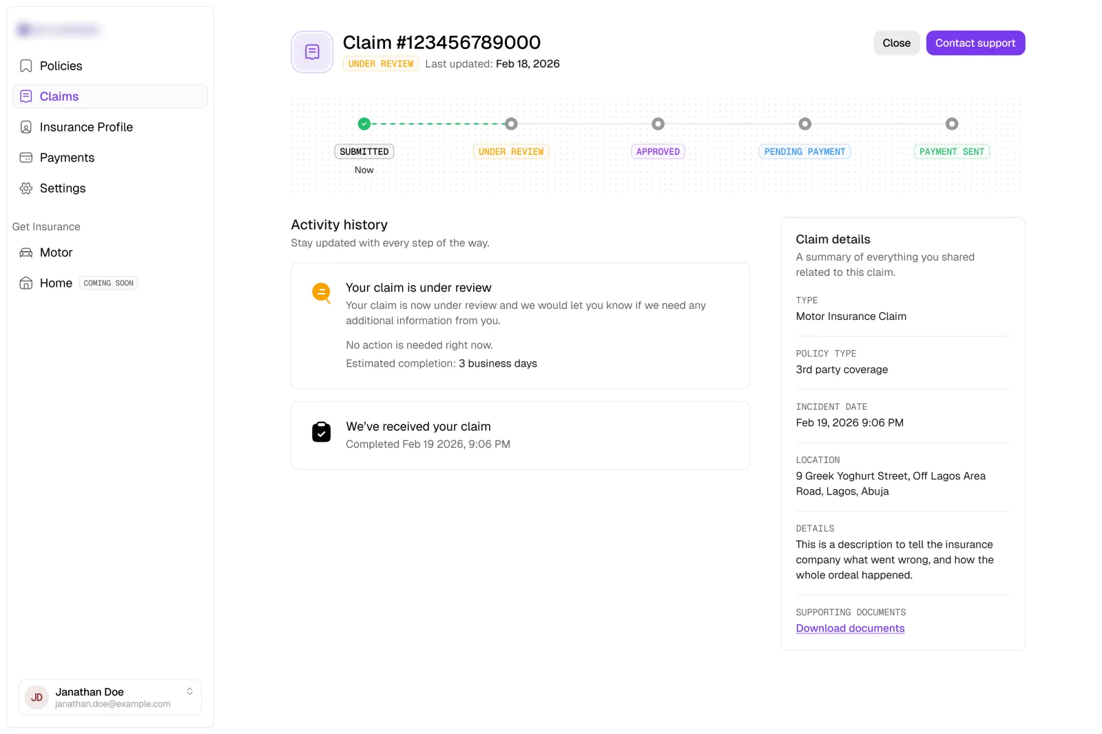
Working solo, I took eight connected flows from concept to dev-ready screens, all held together by one consistent interaction and visual language.
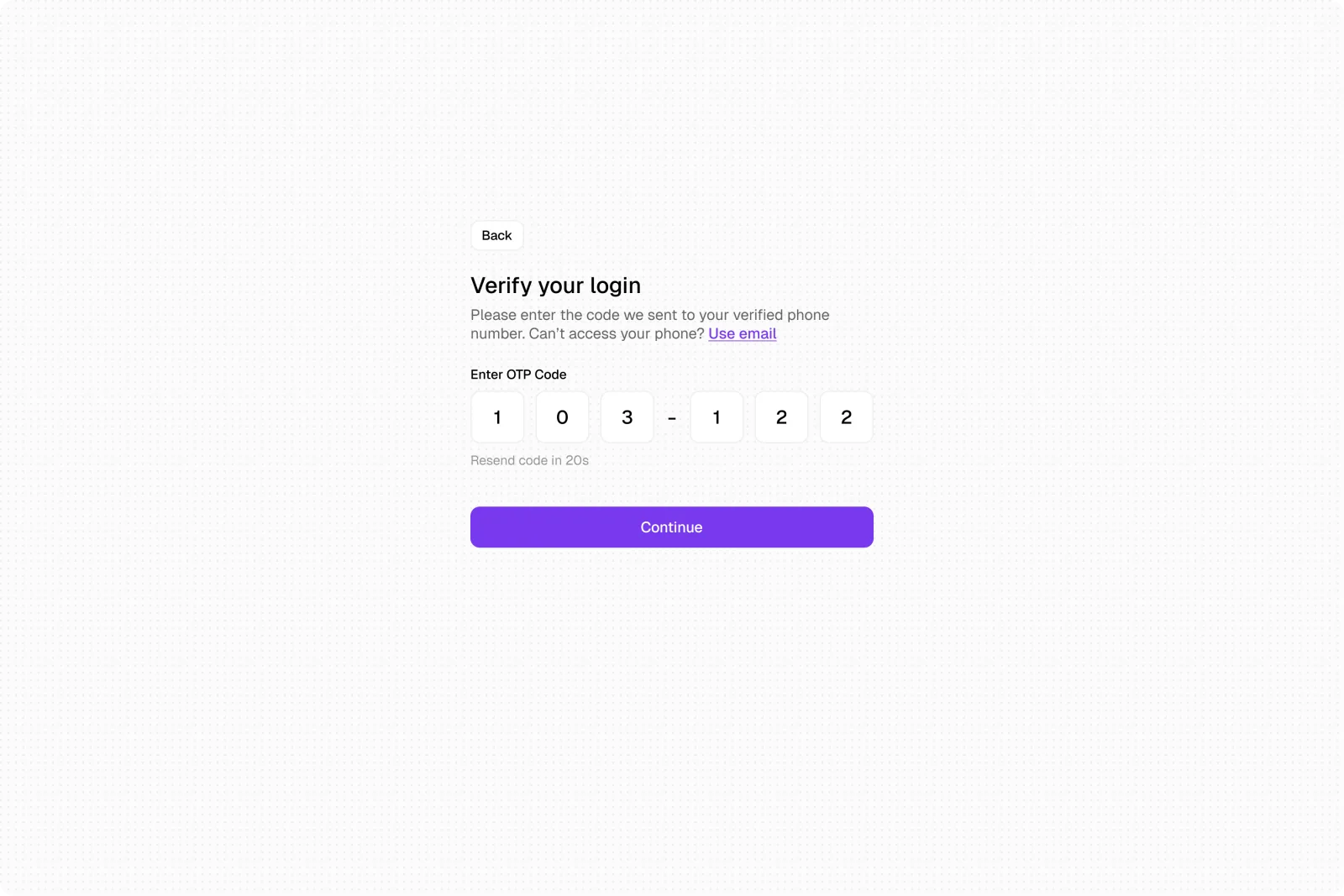
Policies, Claims, Insurance Profile, Payments, Settings, Checkout and Payment, Authentication, and Onboarding.
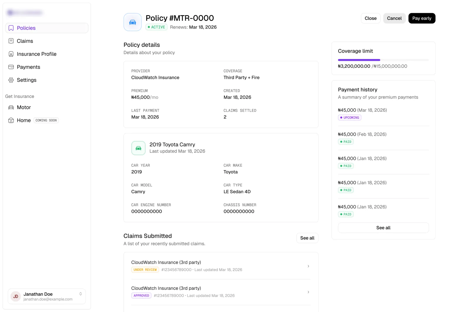
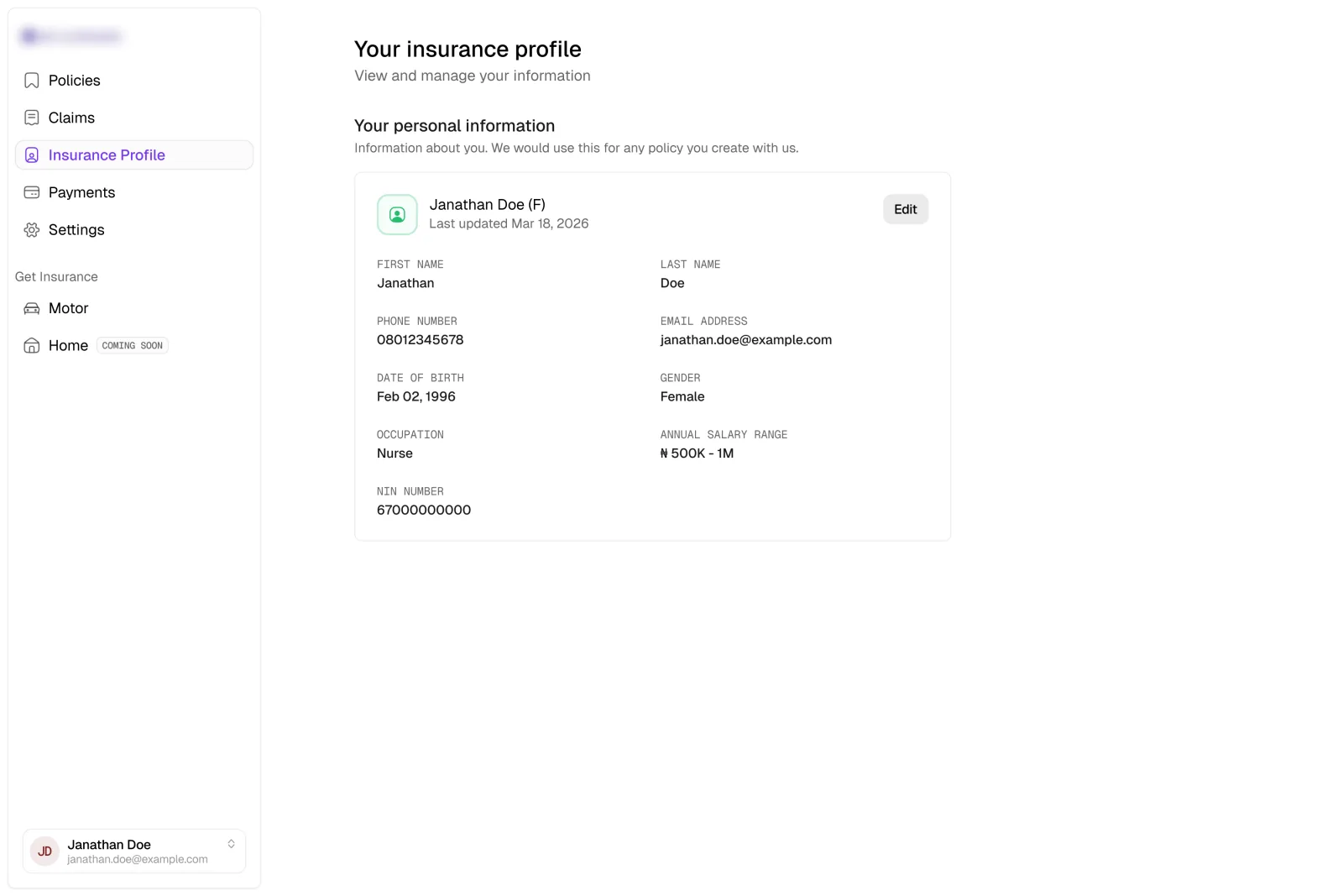
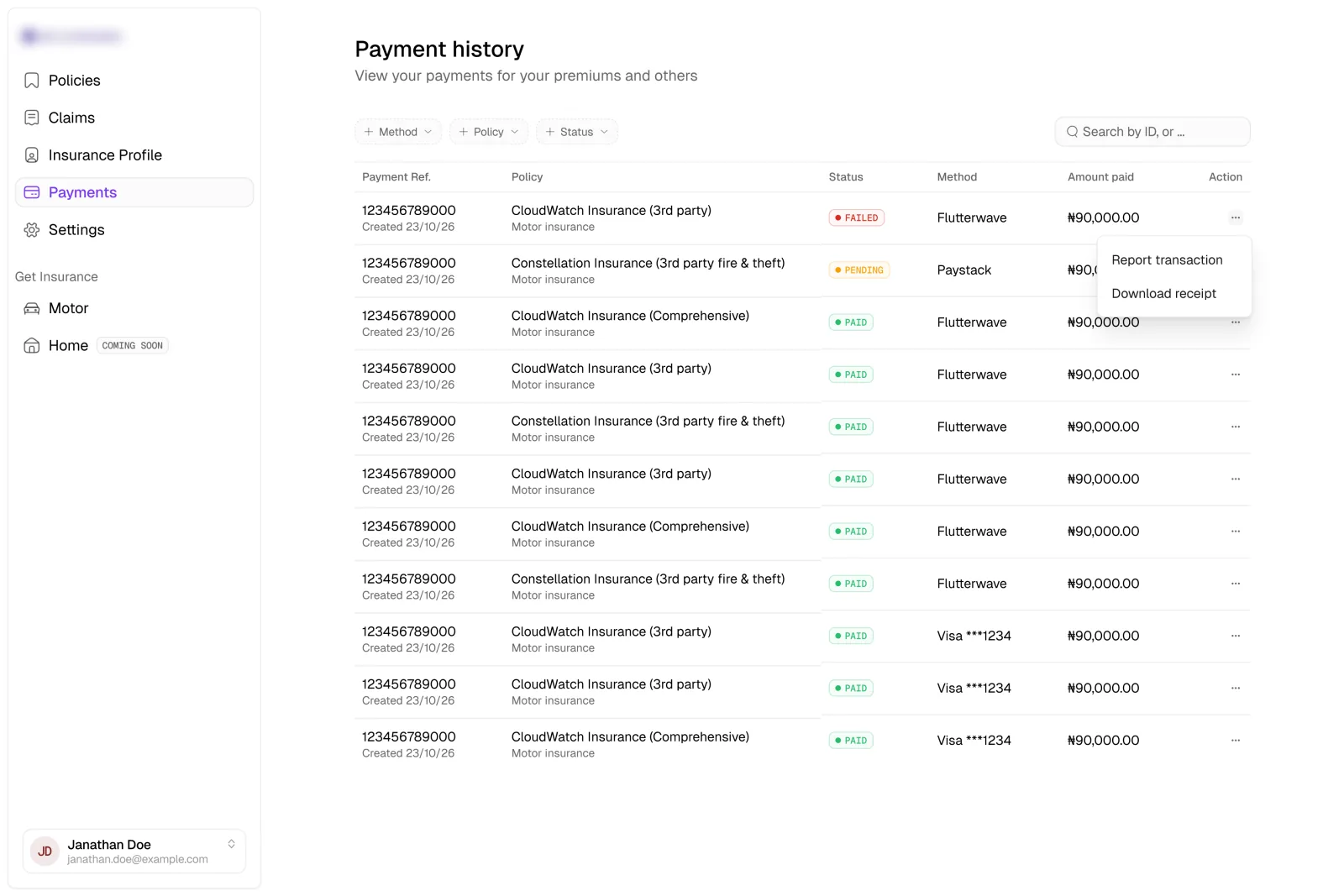
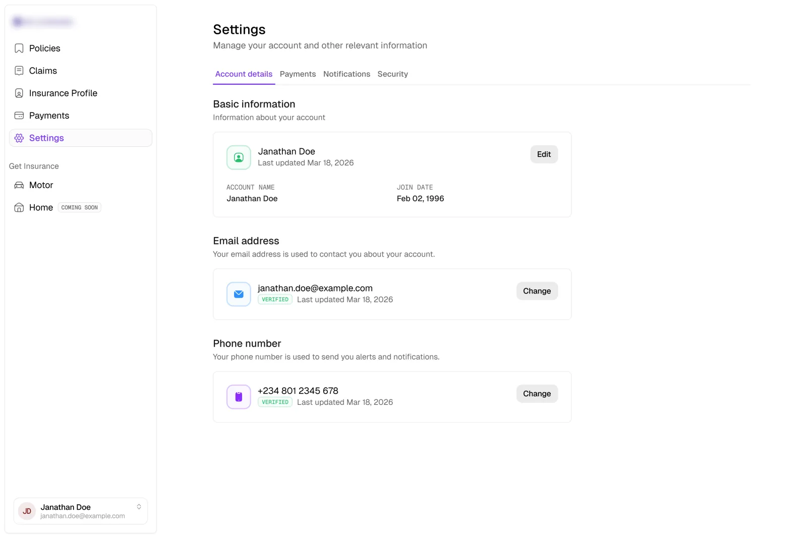
img 1 of 6
My contract ended at launch, before post-launch data was available. I would have measured onboarding completion and drop-off, alongside whether customers could understand their claim status and settlement without contacting support.
Reflection
One idea needed more evidence. The other needed restraint.
The conversational onboarding is the decision that stayed with me. I still think we tend to underrate how quickly people can learn an interface when it is not getting in their way. And if we only ever design for what is already familiar, no one gets shown anything better.
But if I approached it again, I would try to earn the idea rather than relying on instinct alone. I would test the conversational and structured flows against each other, or explore a hybrid that kept the friendliness of a conversation on top of familiar form controls.
The claims tracker taught me the quieter lesson. Sometimes the more considered move is not to improve an element, but to take it out.